Voxco
Voxco theme documentation
Introduction
- Item Name : Voxco - Multiconcept theme for creative folk
- Item Version : v 1.0
- Author : Webdingo
- Support Forum : https://webdingo.ticksy.com/
First of all, Thank you so much for purchasing this template and for being my loyal customer.
You are awesome!
You are entitled to get free updates to this product + exceptional support from the author directly.
Installation #back to top
WordPress installation
To install this theme, you must have a working version of WordPress already installed on your server. http://codex.wordpress.org/Installing.WordPress. Please visit this link for instructions on installing WordPress.
Once you have downloaded the package from ThemeForest, inside you will find the file voxco.zip which is what you need to install.
Theme installation (WordPress) – voxco.zip
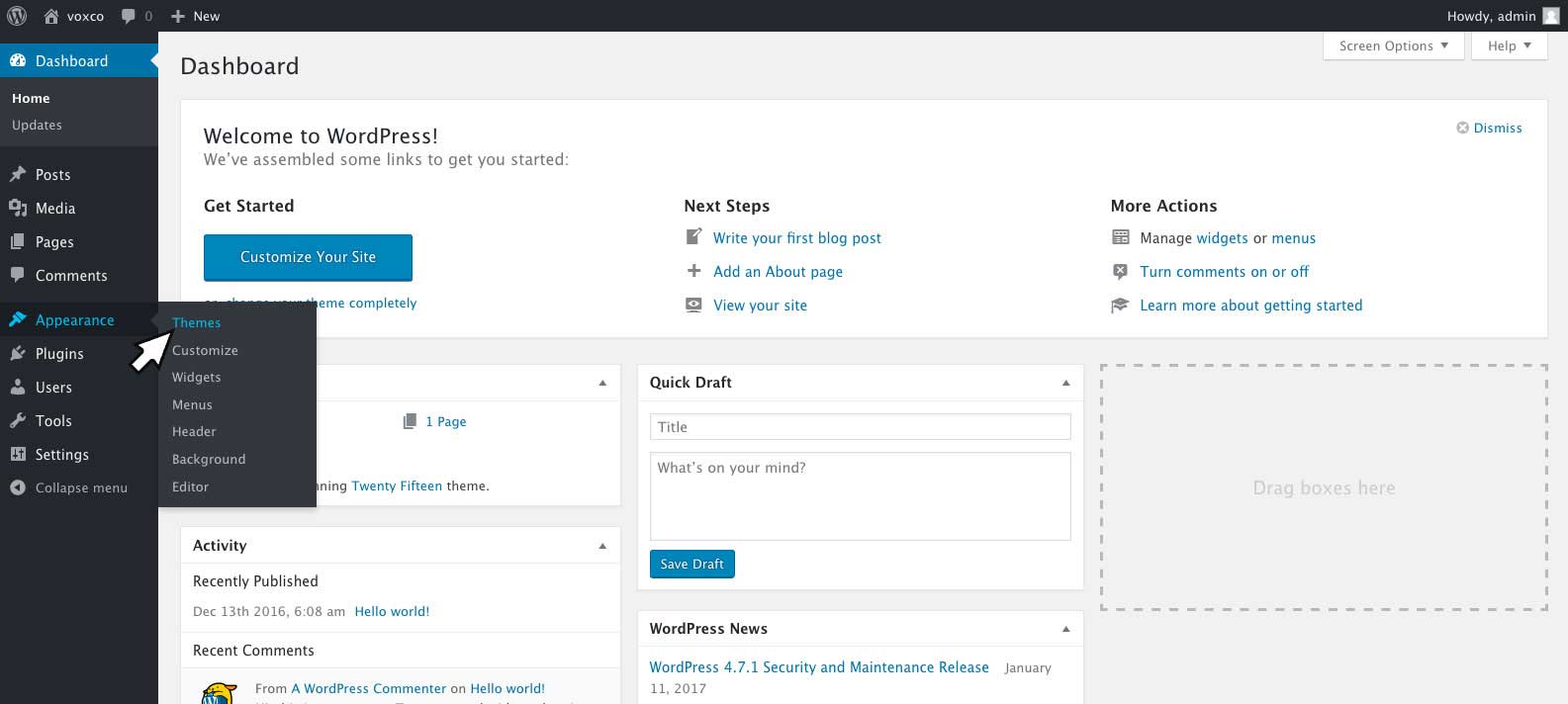
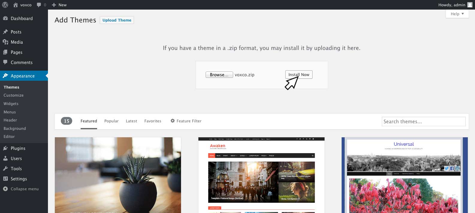
Click Appearance tab and click on Themes
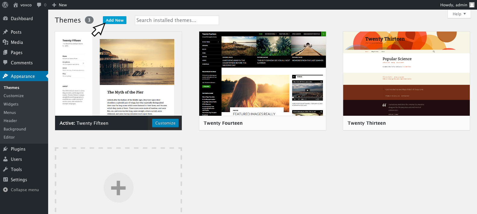
Click on Add New button
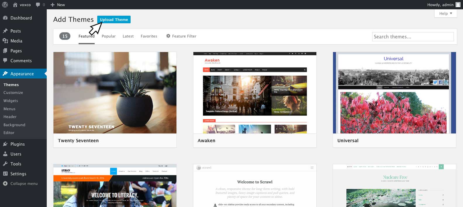
Click Upload Theme button
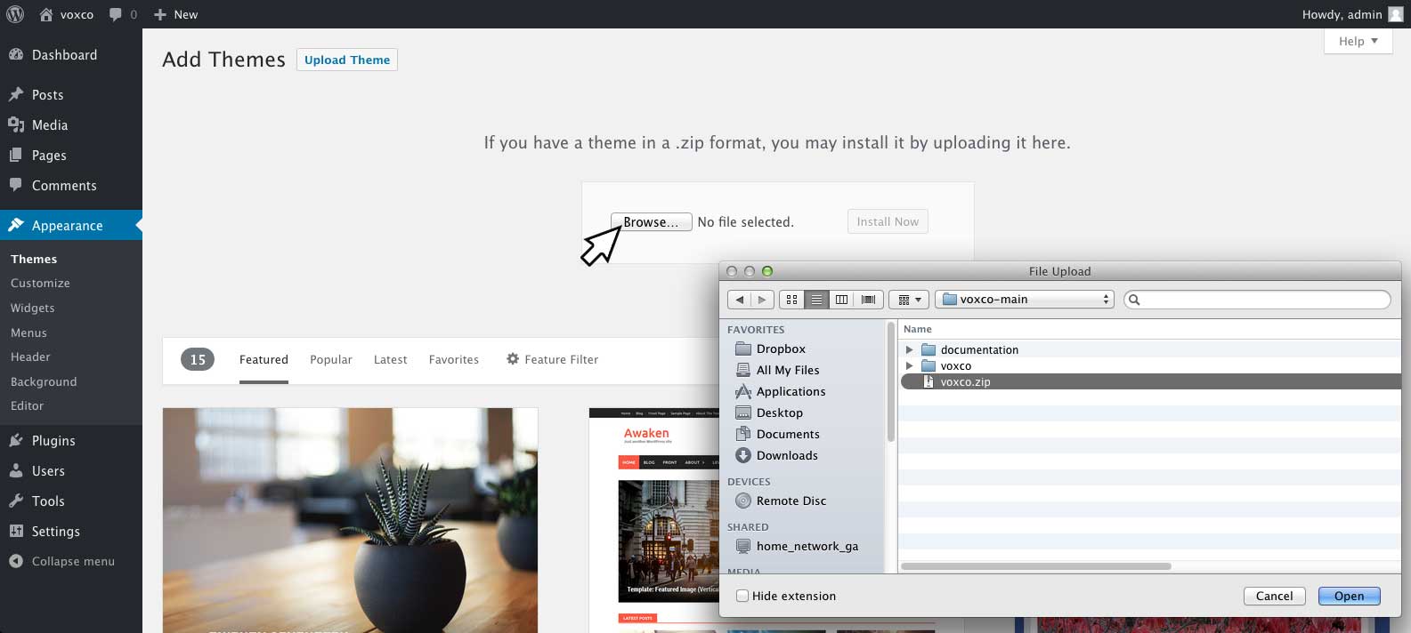
Click Browse and locate the voxco.zip file you have downloaded from ThemeForest (make sure you have downloaded the “Installable zip” as this is what you would upload to WordPress. If you have downloaded the whole package be sure to extract it and locate the theme (voxco.zip) which is inside the voxco-main folder.
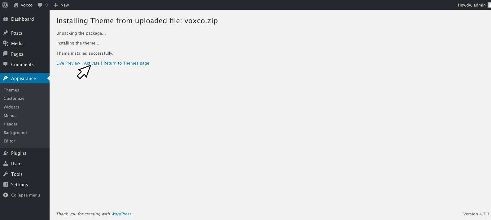
Once you have located the file, click install now.
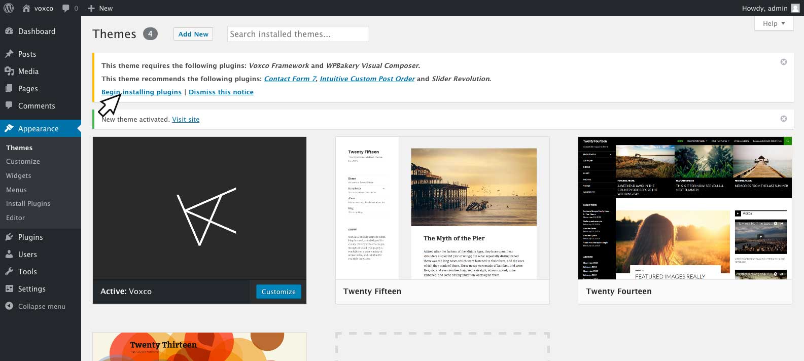
Click Activate
Installing required plugins
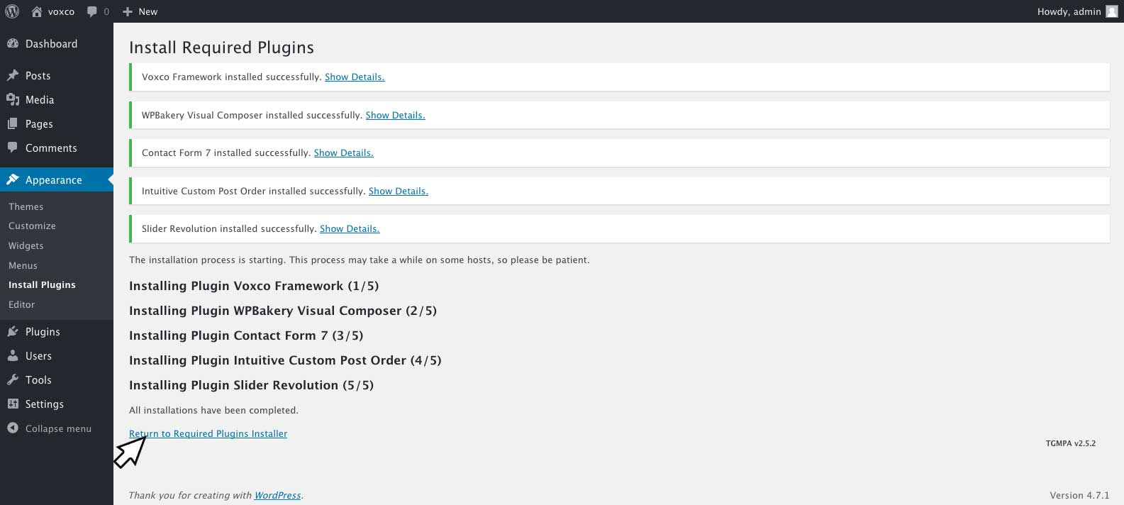
Once the theme is activated, you will see a notice of required plugins (Voxco Framework and WPbakery Visual Composer) and also some recommended plugins (Contact Form 7, Intuitive Custom Post Order and Slider Revolution).
Click Begin Installing Plugins
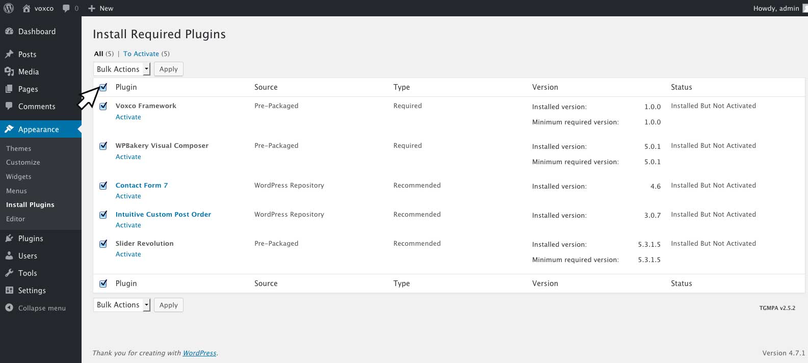
Click Plugin checkbox at top of form to select all plugins.

Under Bulk Actions menu, select Install, click Apply. Wait untill the process is compleated
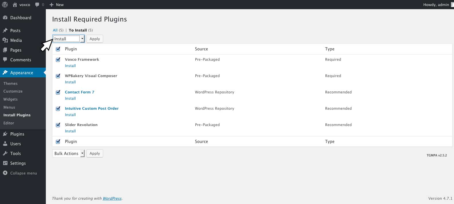
Once the plugins have been installed click Return to Required Plugins Installer.
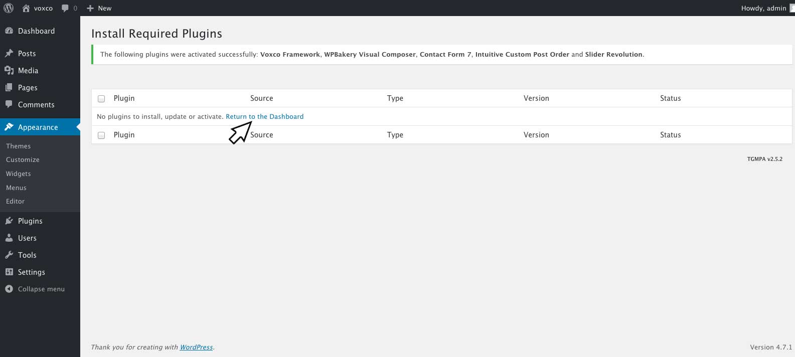
Click Plugin checkbox at top of form to select all plugins.
Under Bulk Actions menu, select Activate, click Apply. Wait untill the process is compleated.

Once compleated click Return to the Dashboard to refresh your dashboard tabs.
Alternatively you may like to select individual plugins of your choice, by clicking the desired plugin and following the above actions (without clicking the Bulk Actions Box) Please note that Voxco framework and WPbakery Visual Composer are required for the theme's features to function correctly.
Importing Demo Content
Click on Theme Options and click on Demo Importer
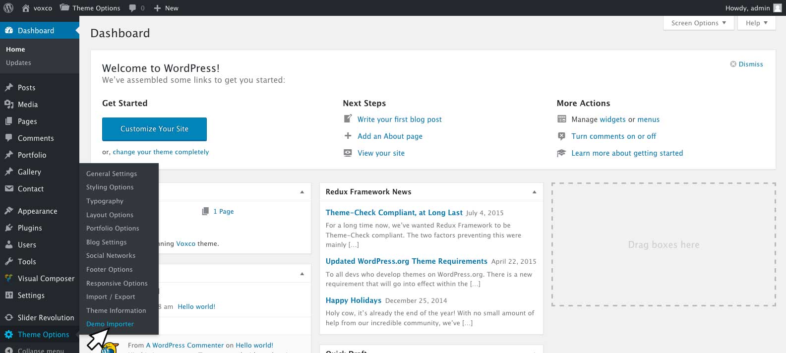
Select the demo content you wish to use and click on Import Demo
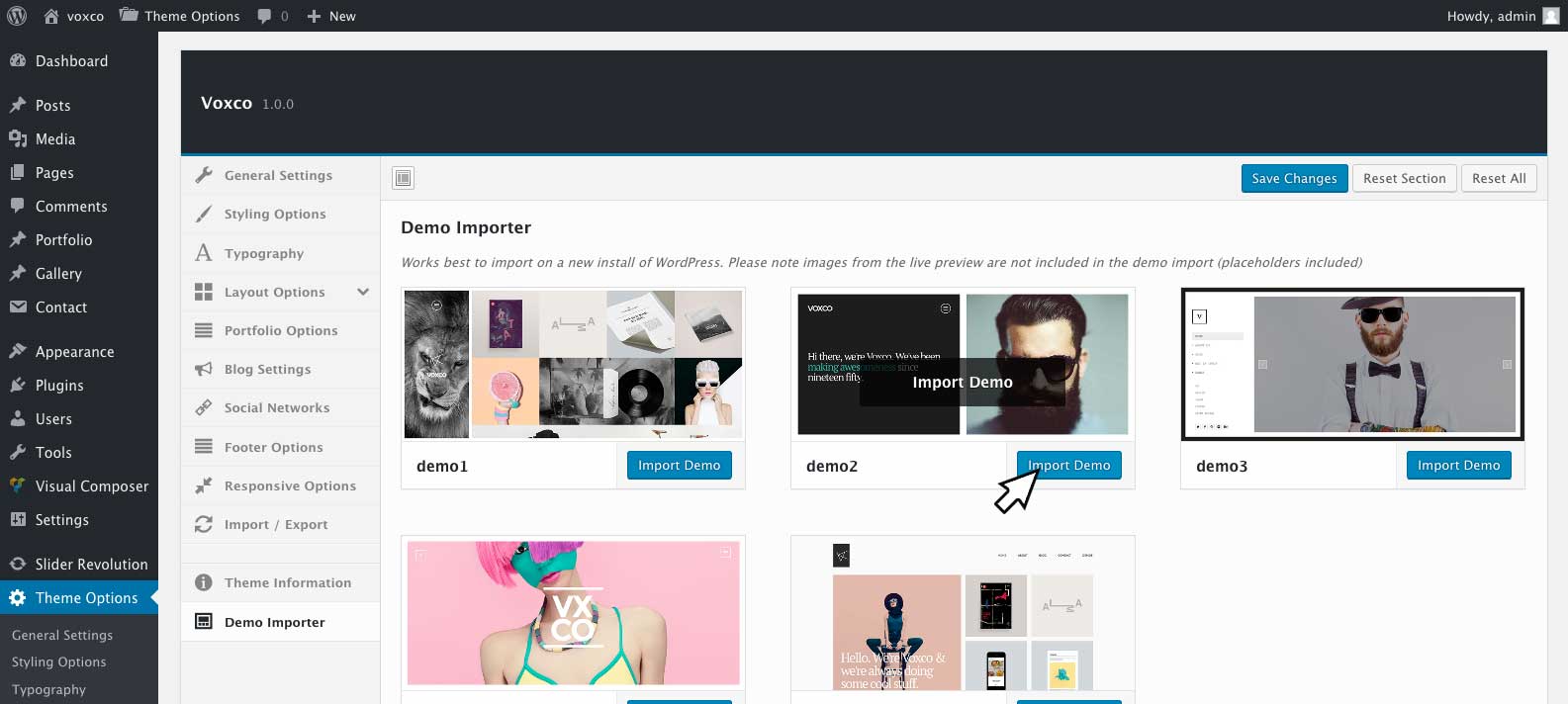
After importing the demo content be sure to refresh your browser window before adjusting any of the theme options to prevent overwriting of the demo import options.
If the Theme Options tab is not visible, you will need to refresh your browser screen after activating the Voxco Framework plugin.
Theme Installation Troubleshooting #back to top
The theme should install without any errors, although on some occasions some users may encounter the following errors:
The package could not be installed. The theme is missing the style.css stylesheet.
A common issue that can occur when installing a WordPress themes is “The package could not be installed. The theme is missing the style.css stylesheet.” error message being displayed when uploading or activating the theme. This is caused by trying to upload the full download package and not the installable theme please see this guide on downloading your theme.
Are you sure you want to do this?
This error typically happens for one of the following reasons:
A. The upload limit on your server isn’t large enough and you must update your PHP.INI file to increase the upload_max_filesize value or contact your webhost to increase it. This is a common request for WordPress themes and plugins and they should be able to help you out.
B. Your server’s memory limit to PHP is too low. To increase your memory limit please see this guide on increasing your memory limit
C. You are trying to upload the full download package and not just the installable theme please see this guide on downloading your theme.
Necessary Plugins #back to top
Voxco Framework
Is a required plugin for the themes features to function correctly. It incldes theme options for the theme as well as several shortcodes and custom posts designed specifically to work with Voxco and integrate with Visual Composer
Visual Composer
Is a premium page builder plugin that is included with the theme. It is an easy to use drag and drop page builder that will help you to create any layout you can imagine quickly and easily with no programming knowledge required. For more information about using visual composer you view the documentation here.
Recommended Plugins #back to top
Revolution Slider
Is a premium slider plugin that is included with the theme. It is an all purpose displaying solution that allows for showing almost any kind of content with highly customizable, transition effects, custom animations and will be required for the demo 3 and 4 content to function correctly. For more information about using slider revolution you, view the documentation here.
Contact Form 7
You can use any contact form plugin you like. The Contact Form 7 plugin is my preferred plugin and I have included styles and options for it in the theme. You can view the author's documentation here http://contactform7.com/docs/
Intuitive Custom Post Order
This is a great plugin and will come in handy if you need to re order your portfolio and blog posts. It will allow you to arrange the order your posts are displayed using drag and drop in your wordpress dashbord.
Once the plugin is installed and activated you can select sortable items from 'Intuitive CPT' menu of Setting menu in WordPress. Once you have selected sortable items you will then be able to arrange the order of posts from the All Post page in your dashboard using drag and drop.
Creating Blog Pages - #back to top
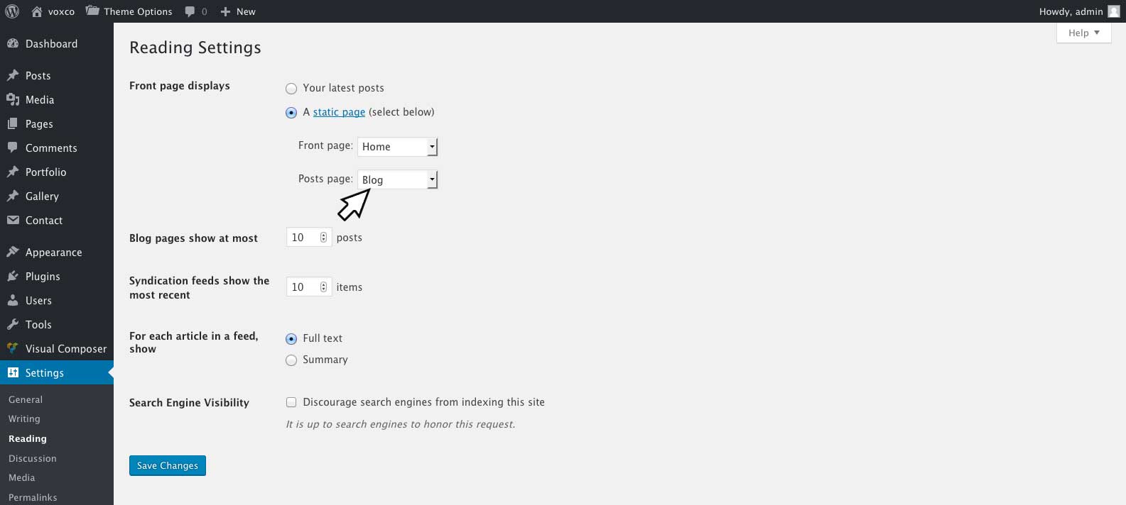
If you wish your home page to display latests posts there is no need to create a new page for blog posts, you can simply select 'Front Page Displays' > 'Latests Posts' under 'Settings' > 'Reading'
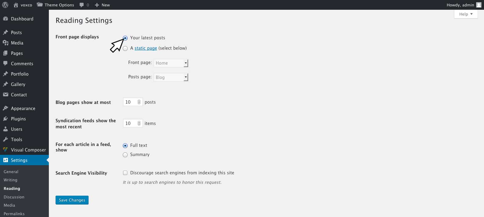
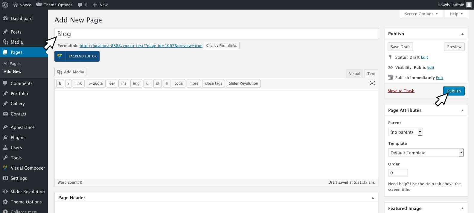
To create a seperate blog page you will first need to create a blank page by going to 'Pages' > 'Add New'. Enter the title of your page and click 'Publish'.
Once the page has been published you can set the the page to display your latest posts by going to 'Settings' > 'Reading' > 'Front page displays' > 'Static Page' > 'Posts Page'.
For further customization of your blog page please see - Blog Settings
Creating Blog Posts - #back to top
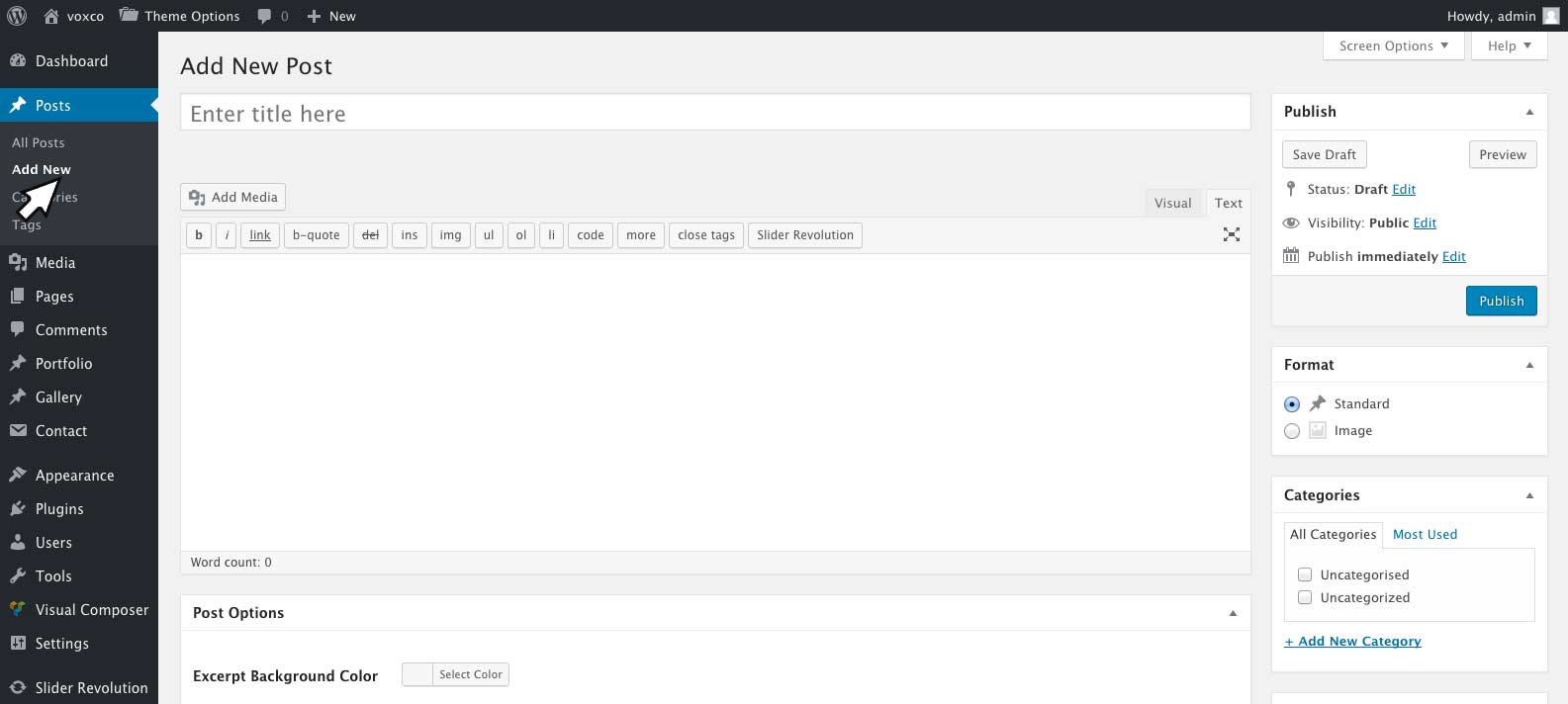
You can create a new blog posts by going to 'Posts' > 'Add New'.
If you wish to use Visual Composer to format your post please see Enableing Visual Composer on Pages, Posts and Portfolios
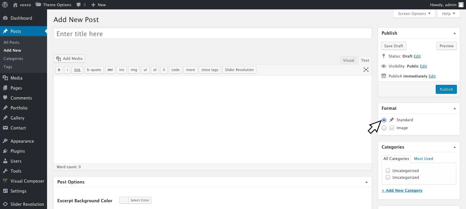
Post Formats
You can select the post format via the format metbox on the right hand side of your edit post screen.
| Option Name | Description |
|---|---|
| Standard | Stardard posts will display the post feature image and post excerpt for archive pages. You can set the length of the excerpt to be displayed by going to 'Theme Options' > 'Blog Settings' > 'Automatic Excerpt Length' and entering in the number of words to be displayed. The automatic excerpt length can also be overridden on individual posts by entering a manual excerpt. To insert a manual excerpt, you can click 'Screen Options' at the top of your edit posts screen and check 'Excerpt'. You can then enter your manual excerpt in the 'Excerpt Field' at the bottom of your posts editor screen. |
| Image | Image Post will display the display the posts feature image for archive pages. The post title and meta will be displayed while hoveing the feature image. |
Post Settings
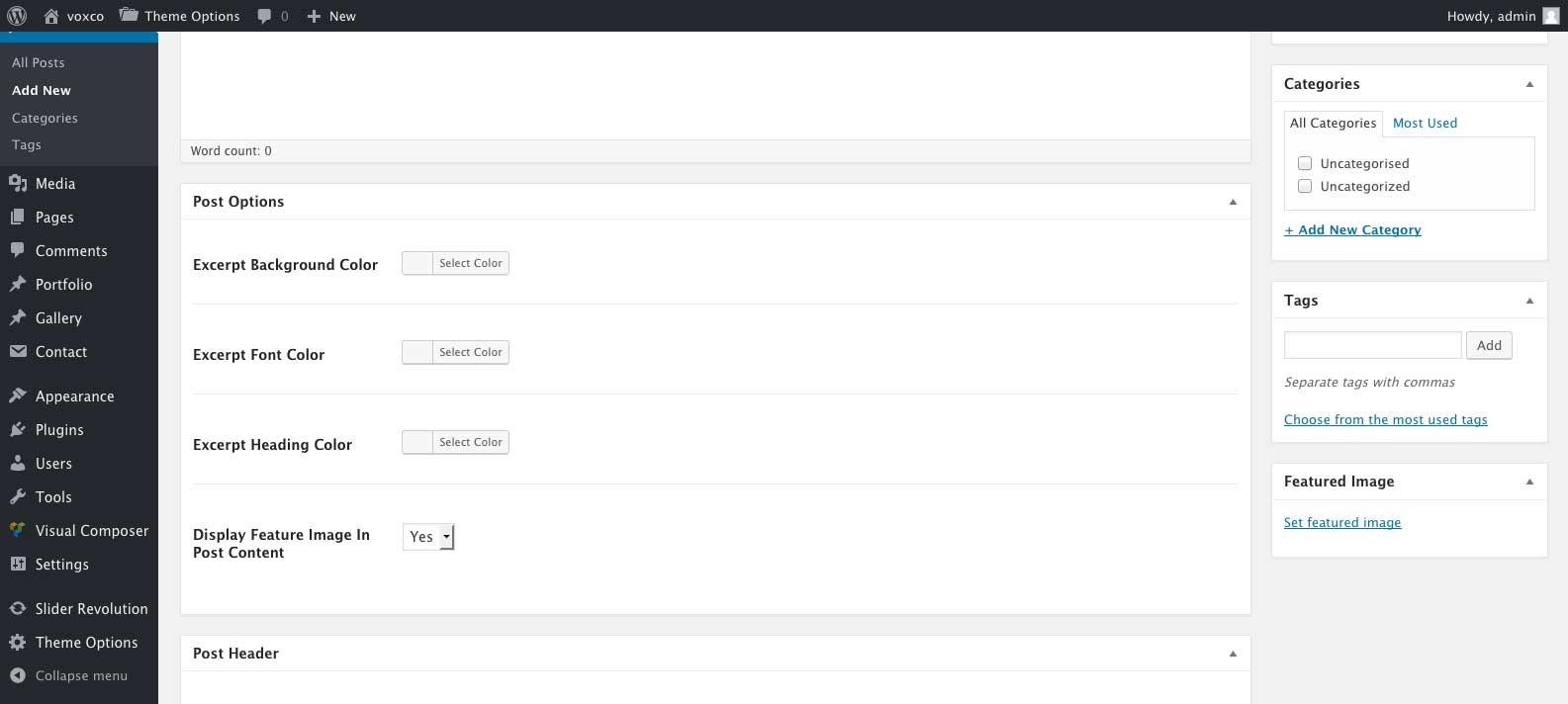
Blog posts include several custom settings which can be found at the bottom of your edit post screen including:
Post Options
| Option Name | Description |
|---|---|
| Excerpt Background Color | Refers to the excerpt background color for standard posts, and the rollover background color for image posts. |
| Excerpt Font Color | Refers to the excerpt color for standard posts, and the author/posts date color for image posts. |
| Excerpt Heading Color | Refers to the post title color. |
| Display Feature Image In Post Content | Select yes or no to display the post feature image at the top of your post content or not. |
Post Header
For information on post header options please see Page/Post Headers
Voxco Slider Options
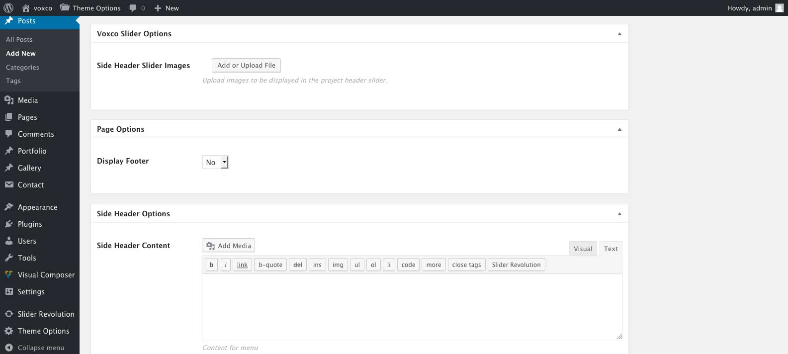
Voxco Slider Options meta box is only available if you are using the side header layout for your site. You may select images in this field which will be displayed in the side header slider for the page. If left empty the defult settings under 'Theme Options' > 'Side Header Settings' will be used.
Page Options
| Option Name | Description |
|---|---|
| Display Footer | Select yes or no to turn the footer display on/off for the post. |
Side Header Options
Options are only available for side header layouts with menu style three
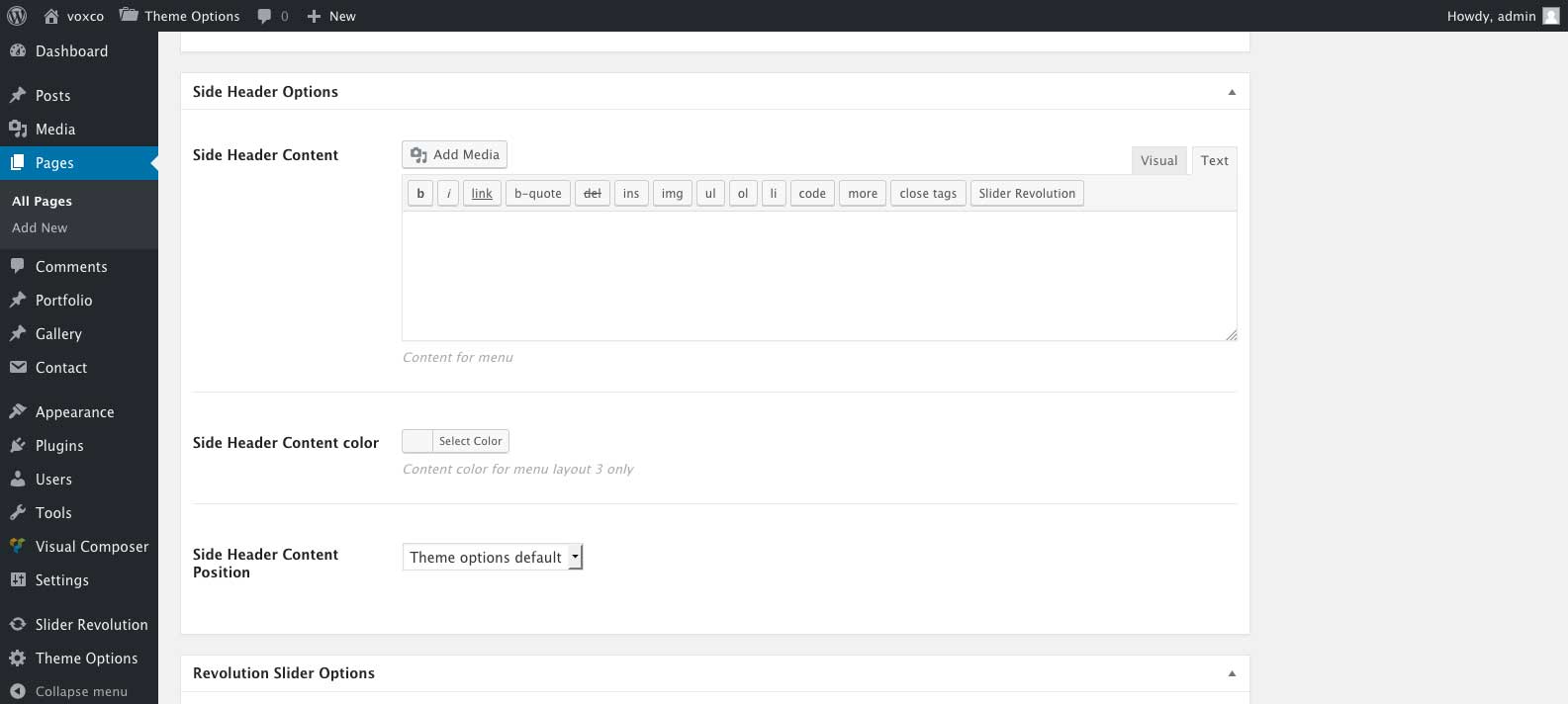
| Option Name | Description |
|---|---|
| Side Header Content | Enter the content to be displayed in the side header, leave empty for no content. |
| Side Header Content color | Select the color for the side header text. |
| Side Header Content Position | Select the content position for the side header. |
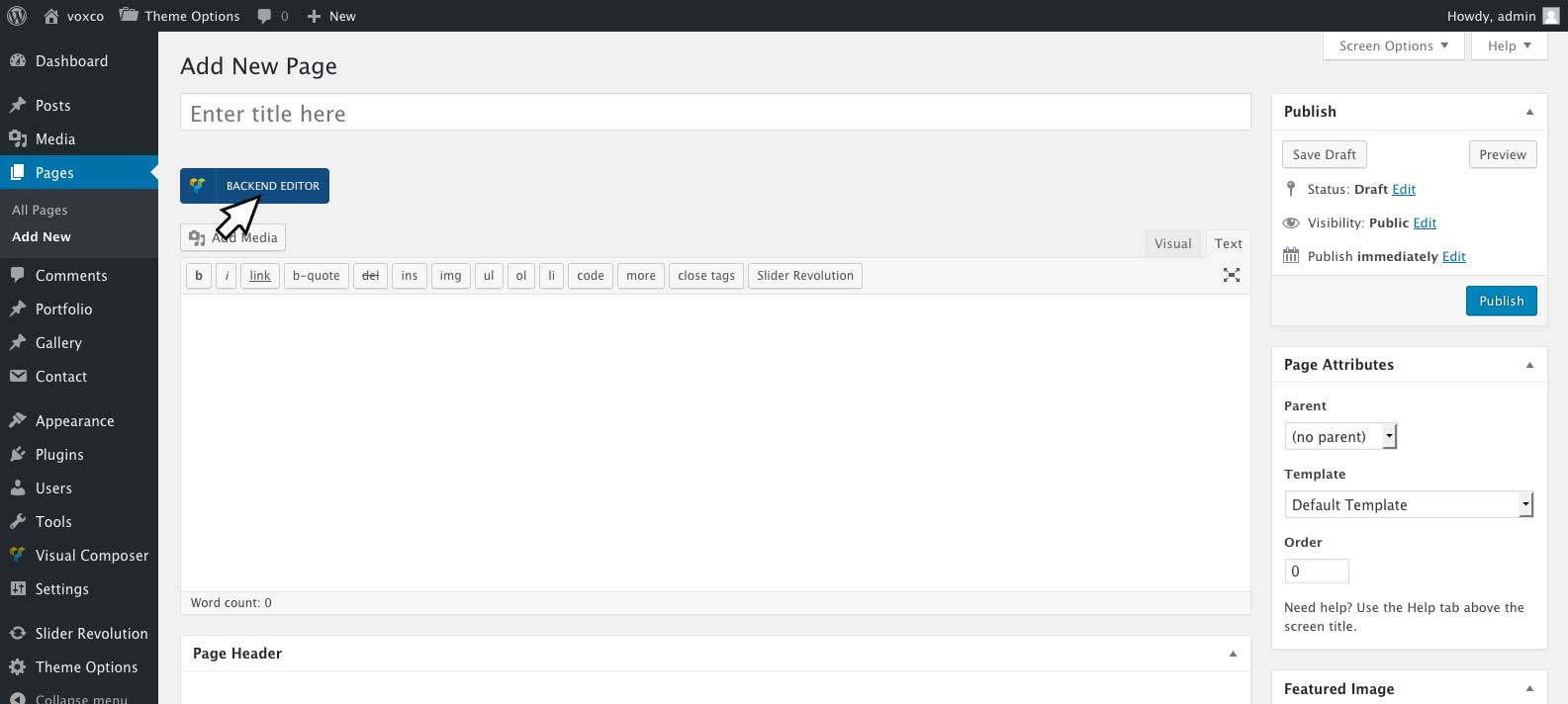
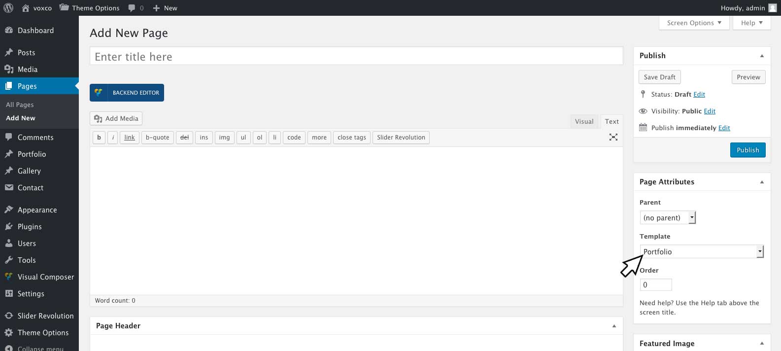
Creating Standard Pages - #back to top
A standard page can be created by going to 'Pages' > 'Add New' and selecting the default template under Page Attributes. Visual Composer will be enabled on pages by defualt. To disable/re-enable it for pages please see Enableing Visual Composer on Pages, Posts and Portfolios To use Visual Composer to format your page click Back End Editor.
Page Settings
Pages include several custom settings which can be found at the bottom of your edit page screen including:
Page Header
For information on page header options please see Page/Post Headers
Voxco Slider Options
Voxco Slider Options meta box is only available if you are using the side header layout for your site. You may select images in this field which will be displayed in the side header slider for the page. If left empty the default settings under 'Theme Options' > 'Side Header Settings' will be used.
Page Options
| Option Name | Description |
|---|---|
| Display Footer | Select yes or no to turn the footer display on/off for the post. |
Side Header Options
Options are only available for side header layouts with menu style three
| Option Name | Description |
|---|---|
| Side Header Content | Enter the content to be displayed in the side header, leave empty for no content. |
| Side Header Content color | Select the color for the side header text. |
| Side Header Content Position | Select the content position for the side header. |
Creating Portfolio Pages - #back to top
A portfolio page can be created by going to 'Pages' > 'Add New' and selecting the portfolio template under Page Attributes.
Alternatively you can display portfolio posts on any default page template buy using the portfolo element in visual composer please see Visual Composer for further instructions on using visual composer and the portfolio content element.
Portfolio Page Settings
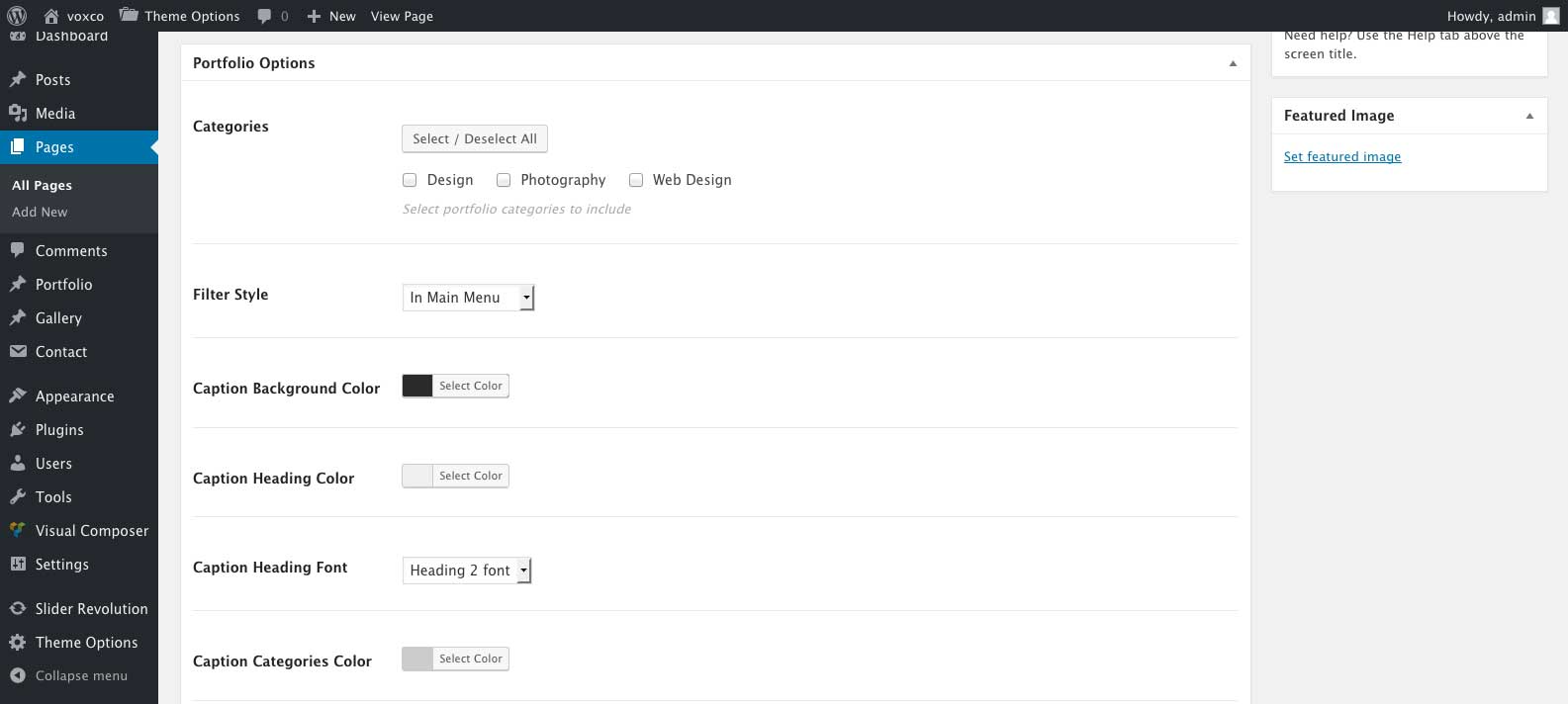
The portfolio page template includes several custom settings which can be found at the bottom of your edit page screen. If you are unable to see the following settings after selecting the portfolio template, please save your page and refresh your browser window.
Portfolio Options
| Option Name | Description |
|---|---|
| Categories | Select which portfolio categorys you would like the portfolio page to display. |
| Filter Style |
In Main Menu - Will place the filter categories in your main menu Above Portfolio - Will place the filter categories above your portfolio posts. No Filters - Will remove the filter categories. |
| Caption Background Color | Setting for portfolio posts caption background color. Can be overridden on individual portfolio post under 'Post Options' In 'Portfolio' > 'Edit Item'. |
| Caption Heading Color | Setting for portfolio posts caption heading color. Can be overridden on individual portfolio post under 'Post Options' In 'Portfolio' > 'Edit Item'. |
| Caption Heading Font | Setting for portfolio posts caption heading font. Font families can be adjusted under 'Theme Options' > 'Typography'. |
| Caption Categories Color | Setting for portfolio posts caption categories font color. Can be overridden on individual portfolio post under 'Post Options' In 'Portfolio' > 'Edit Item'. |
| Caption Categories Font | Setting for portfolio posts caption categories font. Font families can be adjusted under 'Theme Options' > 'Typography'. |
| Caption Vertical Alignment | Setting for the vertical position of portfolio posts caption text. Can be overridden on individual portfolio post under 'Post Options' In 'Portfolio' > 'Edit Item'. |
| Caption Horizontal Alignment | Setting for the horizontal alignment of portfolio posts caption text. Can be overridden on individual portfolio post under 'Post Options' In 'Portfolio' > 'Edit Item'. |
| Caption Crosshair Position | Setting for the position of the + icon on portfolio posts caption. Can be overridden on individual portfolio post under 'Post Options' In 'Portfolio' > 'Edit Item'. |
| Caption Hover Animation | Setting for animation to be used while hovering portfolio posts. |
Page Header
For information on page header options please see Page/Post Headers
Voxco Slider Options
Voxco Slider Options meta box is only available if you are using the side header layout for your site. You may select images in this field which will be displayed in the side header slider for the page. If left empty, the default settings under 'Theme Options' > 'Side Header Settings' will be used.
Page Options
| Option Name | Description |
|---|---|
| Display Footer | Select yes or no to turn the footer display on/off for the post. |
Side Header Options
Options are only available for side header layouts with menu style three
| Option Name | Description |
|---|---|
| Side Header Content | Enter the content to be displayed in the side header, leave empty for no content. |
| Side Header Content color | Select the color for the side header text. |
| Side Header Content Position | Select the content position for the side header. |
Creating Portfolio Posts - #back to top
You can create a portfolio post by going to 'Portfolio' > 'Add New'.
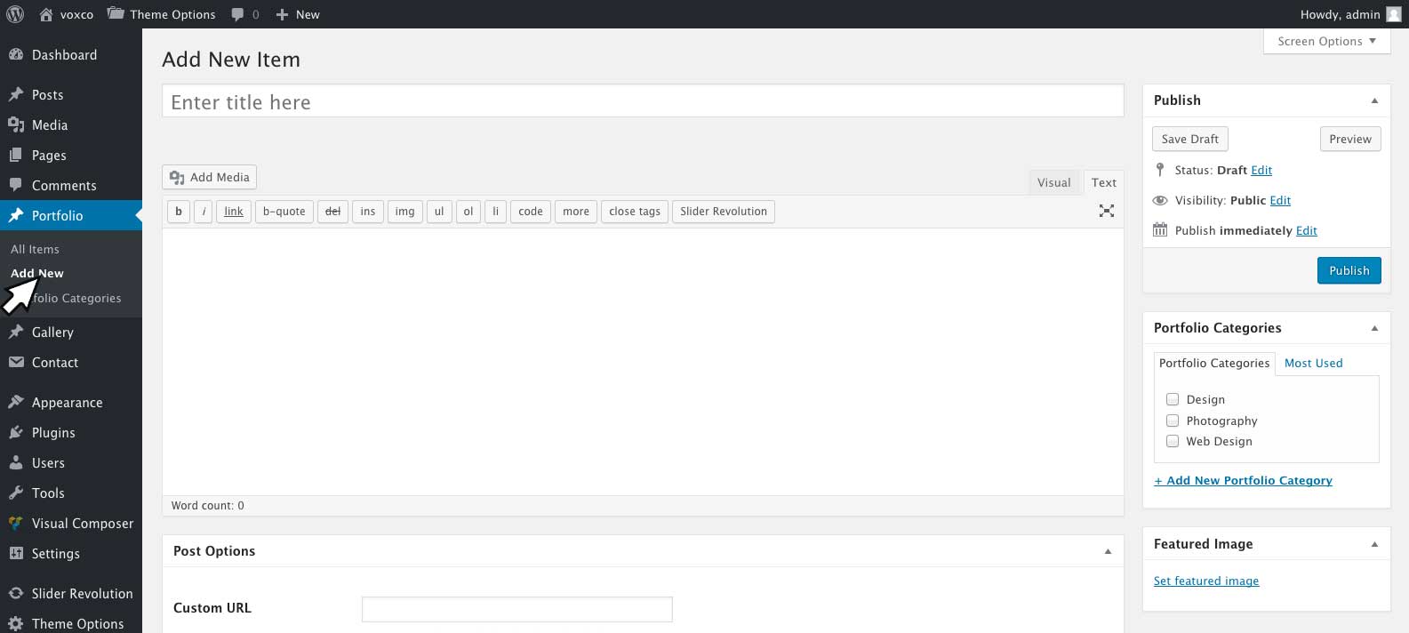
To enable Visual Composer on portfolio posts please see Enableing Visual Composer on Pages, Posts and Portfolios
Post Settings
Portfolio posts include several custom settings which can be found at the bottom of your edit post screen including:
Post Options
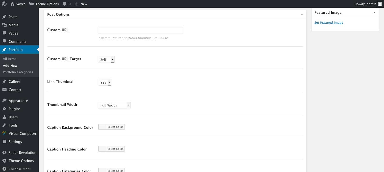
| Option Name | Description |
|---|---|
| Custom URL | Custom link for the portfolio thumbnail, to link the thumbnail to a different URL than the post. |
| Custom URL Target | Select 'Self' to open the Custom URL in the same window. Select 'Blank' to open the Custom URL in a new tab. |
| Link Thumbnail | Disable/Enable the ability to click the portfolio post thumbnail. |
| Thumbnail Width | Select the thumbnail width, portfolio grid sizes can be changed under 'Theme Options' > 'Portfolio Options' > 'Portfolio Grid Column Sizes'. |
| Caption Background Color | Setting for the portfolio post caption background color. Leave empty to use the global settings set on the portfolio page or shortcode. |
| Caption Heading Color | Setting for the portfolio post caption heading color. Leave empty to use the global settings set on the portfolio page or shortcode. |
| Caption Categories Color | Setting for the portfolio post caption categories color. Leave empty to use the global settings set on the portfolio page or shortcode. |
| Caption Vertical Alignment | Setting for the vertical position of the portfolio post caption text. Leave empty to use the global settings set on the portfolio page or shortcode. |
| Caption Horizontal Alignment | Setting for the horizontal alignment of the portfolio post caption text. Leave empty to use the global settings set on the portfolio page or shortcode. |
| Caption Crosshair Position | Setting for the position of the + icon on the portfolio post caption. Leave empty to use the global settings set on the portfolio page or shortcode. |
| Thumbnail Style | Setting for standard style with thumbnail with caption on hover. Or Text on Image style where text will overlay the thumbnail and always be visible. |
| Thumbnail Style Text On Image Text | Text to display for text on image style thumbnail. |
| Thumbnail Style Text On Image Font | Select font to use for the text on image style text. |
Post Navigation
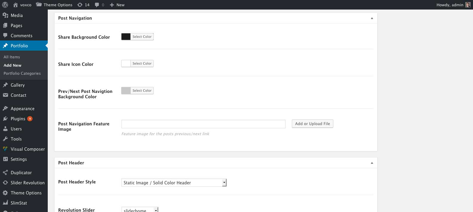
| Option Name | Description |
|---|---|
| Share Background Color | Background color for the share icon box. |
| Share Icon Color | Color for the share icons. |
| Prev/Next Post Navigation Background Color | Background color for the Prev/Next Post link boxes. |
| Post Navigation Feature Image | Image to be displayed while hovering the Prev/Next link to this post. |
Note: The above options are not available for layout side header with menu style three. If you are using the layout side header with menu style three you may style the post navigaion with the following option under Side Header Options.
| Option Name | Description |
|---|---|
| Post Navigation Style | Select light or dark post navigaion buttons. |
Post Header
For information on post header options please see Page/Post Headers
Voxco Slider Options
Voxco Slider Options meta box is only available if you are using the side header layout for your site. You may select images in this field which will be displayed in the side header slider for the page. If left empty the default settings under 'Theme Options' > 'Side Header Settings' will be used.
Page Options
| Option Name | Description |
|---|---|
| Display Footer | Select yes or no to turn the footer display on/off for the post. |
Side Header Options
Options are only available for side header layouts with menu style three
| Option Name | Description |
|---|---|
| Side Header Content | Enter the content to be displayed in the side header, leave empty for no content. |
| Side Header Content color | Select the color for the side header text. |
| Side Header Content Position | Select the content position for the side header. |
| Post Navigation Style | Select light or dark post navigaion buttons. |
Creating Gallery Posts - #back to top
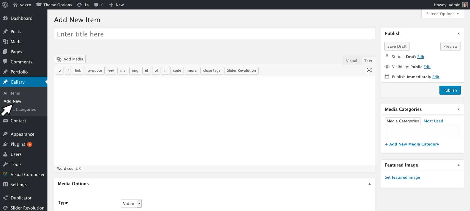
Gallery posts can be created by going to 'Gallery' > 'Add New'.
Any standard WordPress content can be inserted into a gallery post, and this content will display in a popup/modal window when the post thumbnail is clicked. For a full list of WordPress supported embeddes please see https://codex.wordpress.org/Embeds
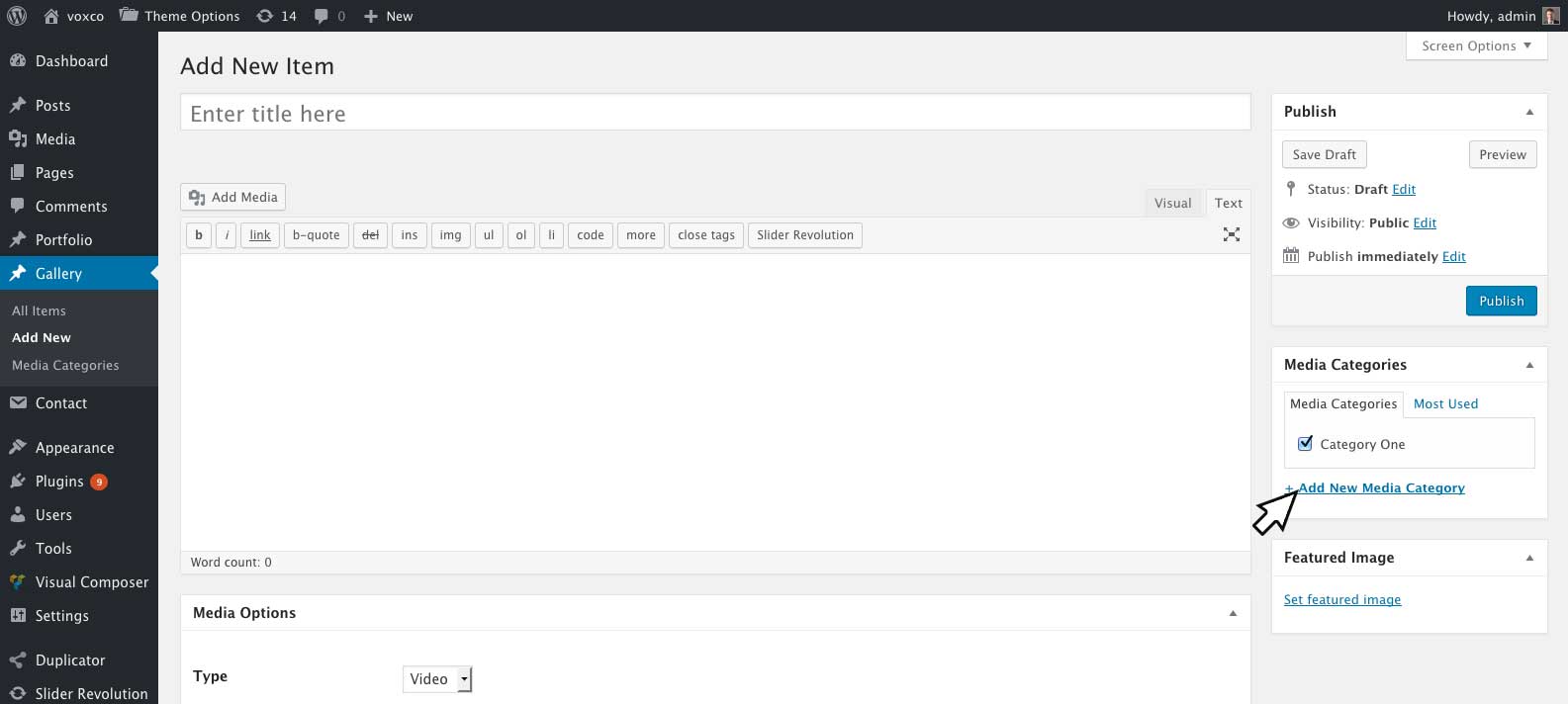
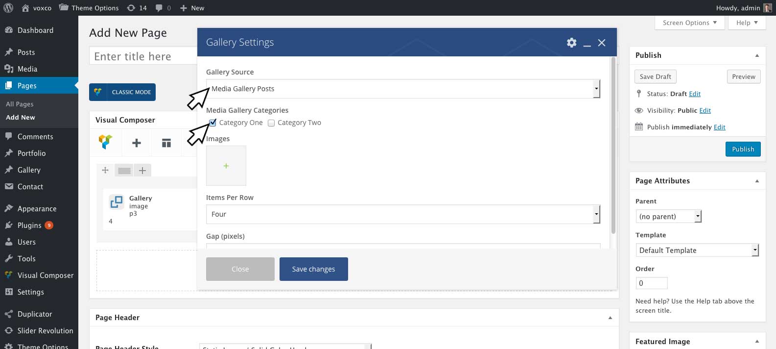
To add a gallery into any page or post you can insert the Visual Composer gallery element. For the gallery element you to display your gallery posts you will first need to assign them a category. You can assign posts categories by selecting them in the media categorires meta box, to add a new category click add new Add New Media Category.
Once your posts have some categories, you can select 'Gallery Source' > 'Media Gallery Posts' and which categores of posts to display in the Visual Composer gallery element. For more information on the gallery element please see Gallery Element
Post Thumbnails
You can set the thumbnail for the post by setting the feature image.
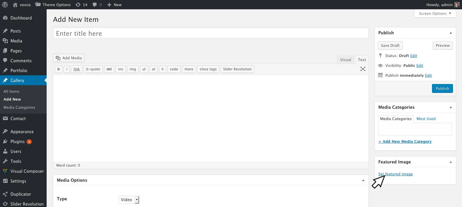
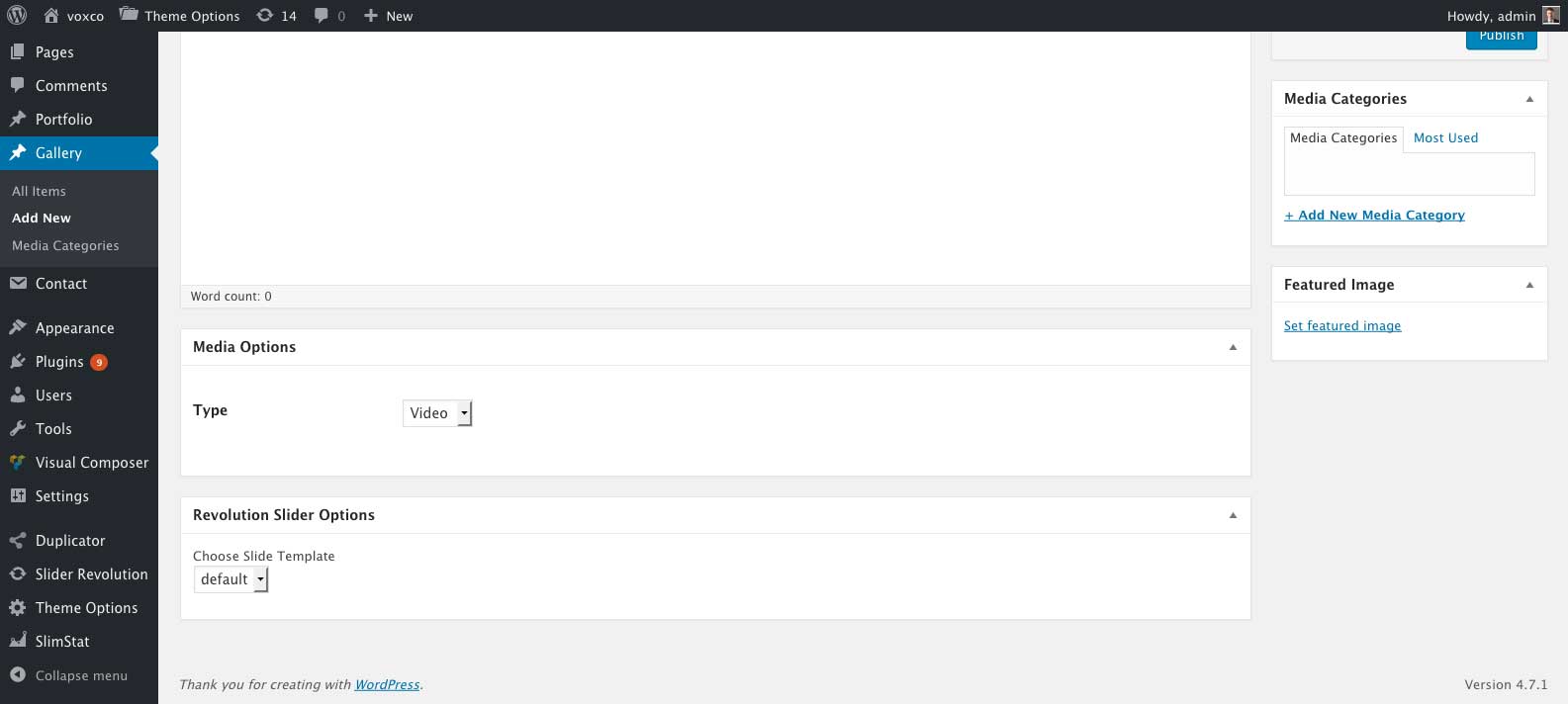
Gallery Media Options
| Option Name | Description |
|---|---|
| Type | Will place a 'video/audio/image' icon overlay on your post thumbnail. |
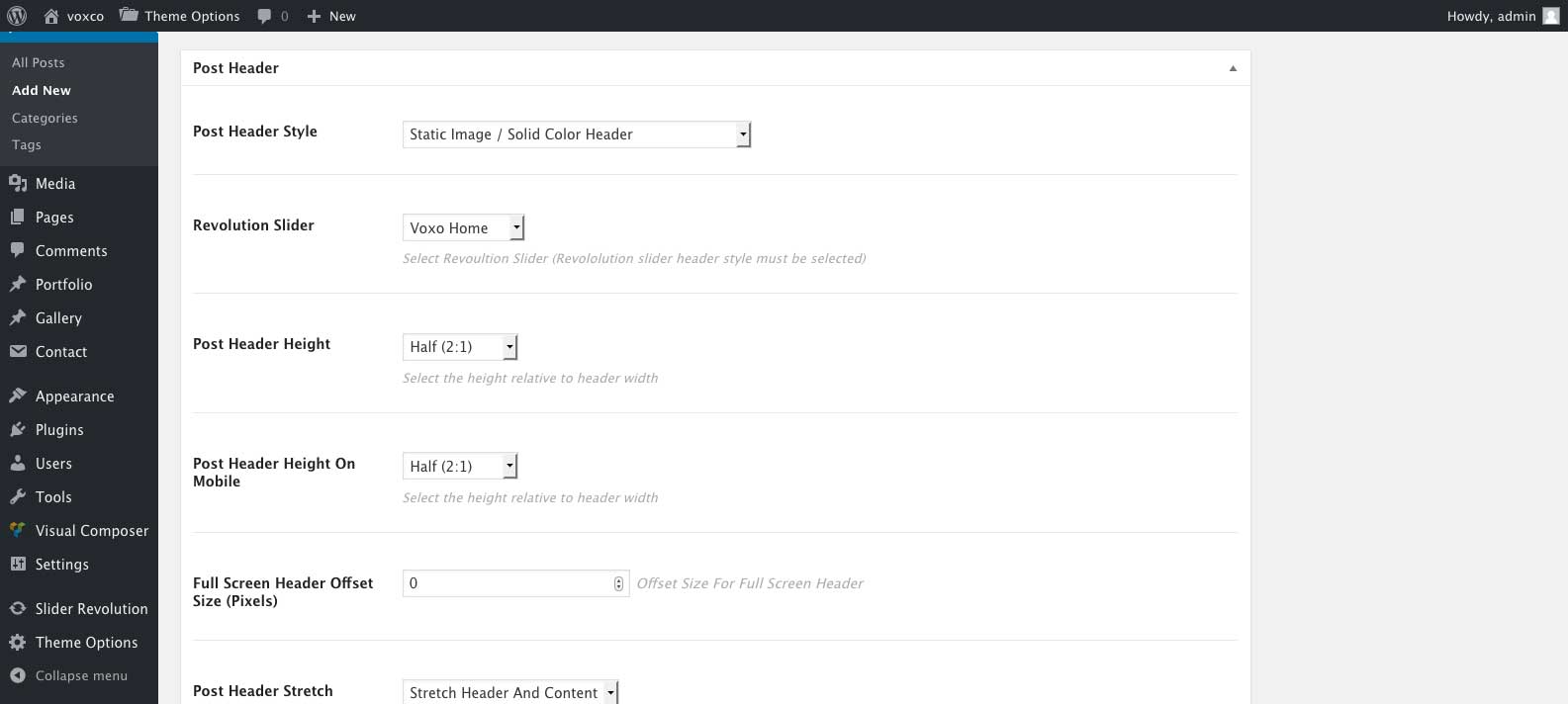
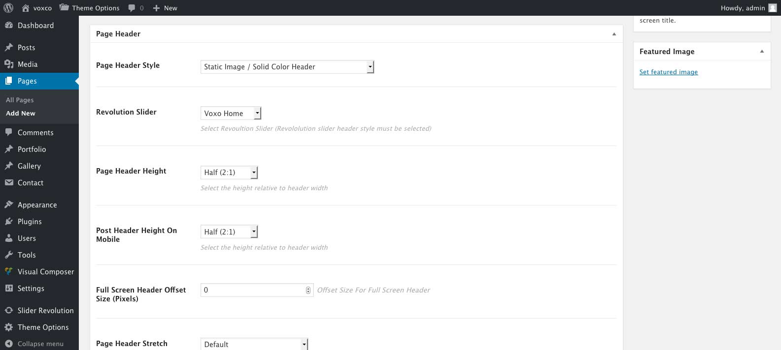
Page/Post Headers - #back to top
Page And Post headers can be styled in the post or page header meta box for each post/page using the following options located at the bottom of your edit post/page screen under 'Page Header' or 'Post Header'.
| Option Name | Description |
|---|---|
| Post/Page Header Style |
Static Image / Solid Color Header - Static image or solid color header. Select the image to display under 'Page Header Background Image' or the color under 'Page Header Background Color'. Parallax image header - Parallax image header, select the image to display under 'Page Header Background Image'. Revolution Slider - Revolution Slider header, select a revoultion slider to display under 'Revolution Slider'. You will need to install and activate the revolution slider to use this header style. For more information on the revolution slider please see Revolution Slider To install the revolution slider please see add link No Header - Will not display a header for the page/post. |
| Revolution Slider | Select a Revolution Slider to be displayed for the Revolution Slider header style. |
| Post/Page Header Height |
Full (1:1) - 1:1 height, the height of the header will be the same as the width of the header. Half (2:1) - 2:1 height, the height of the header will be equal to half of the header width. Half (3:1) - 3:1 height, the height of the header will be equal to one third of the header width. Half (4:1) - 4:1 height, the height of the header will be equal to one quarter of the header width. Full Screen - Full Screen height, the height of the header will be equal to the height of the browser window. |
| Post/Page Header Height on Mobile |
Full (1:1) - 1:1 height, the height of the header will be the same as the width of the header. Half (2:1) - 2:1 height, the height of the header will be equal to half of the header width. Half (3:1) - 3:1 height, the height of the header will be equal to one third of the header width. Half (4:1) - 4:1 height, the height of the header will be equal to one quarter of the header width. Full Screen - Full Screen height, the height of the header will be equal to the height of the browser window. |
| Full Screen Header Offset Size (Pixels) | For use when you have selected a full screen header height. The offset size will reduce the size of a full screen header by ammount of pixels entered. |
| Post/Page Header Stretch |
Stretch header - Full screen header width, header title and sub title will remain within the boxed layout. Streatch header and content - Full screen header width, header title and subtitle will be removed from the boxed layout Only for use while using the standard header with boxed layout. |
| Page/Post Header Margin Bottom | Bottom Margin for the page/post header. Content below the header will be moved down by the ammount of pixesl entered. |
| Post/Page Title Font | Select the post/page title font to be used or no title. You may adjust your fonts under 'Theme Options' > 'Typography'. |
| Page Subtitle | For use with pages only, enter a subtitle to be displayed or leave empty for no subtitle. |
| Page Subtitle Font/Post Meta Font | Select the post/page subtitle font to be used or no title. You may adjust your fonts under 'Theme Options' > 'Typography'. |
| Post/Page Title Color | Select the font color for your page/post title. Leave empty to use the selected fonts theme options color settings. |
| Post/Page Title Alignment | Horiziontal alignment for your post/page title and post meta/subtitle. |
| Post/Page Header Background Image | Upload a background image for use with 'Static Image' or 'Parallax Image' header styles. |
| Post/Page Header Background Color | Select a background color for use with 'Solid Color' header style. |
Visual Composer #back to top
Visual Composer official documentation can be viewed at Visual Composer Pagebuilder for WordPress
Enableing Visual Composer on Pages, Posts and Portfolios
You can enable it on posts and portfolio posts by going to 'Visual Composer' > 'Role Manager'.
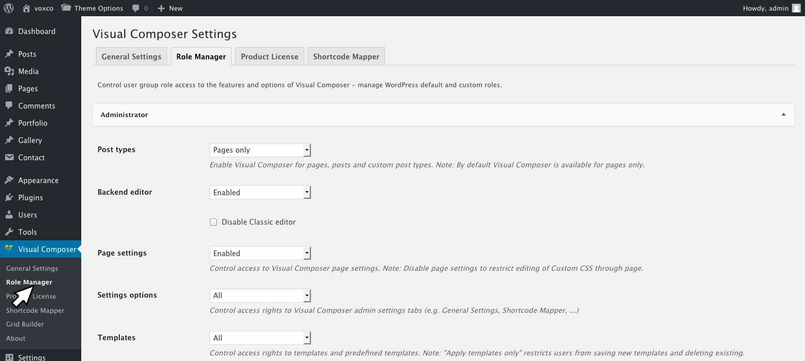
From the 'Post types' drop down select 'Custom' then check 'Posts' and 'Portfolios'.
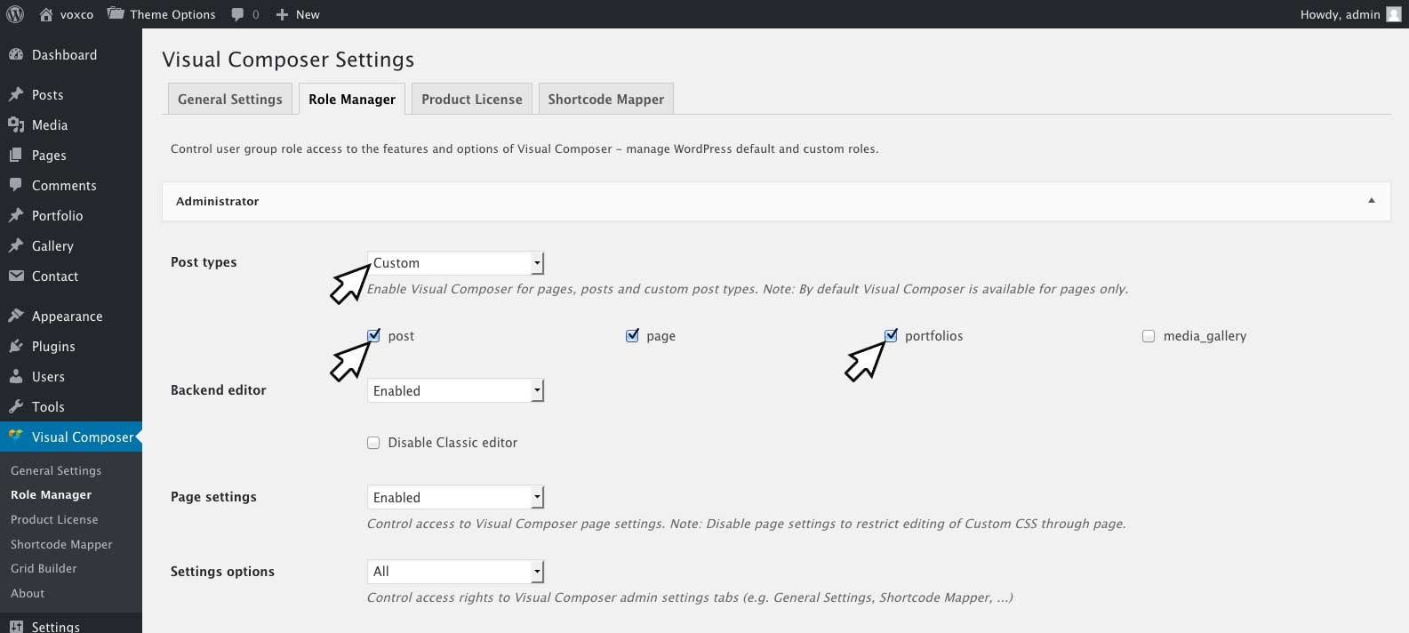
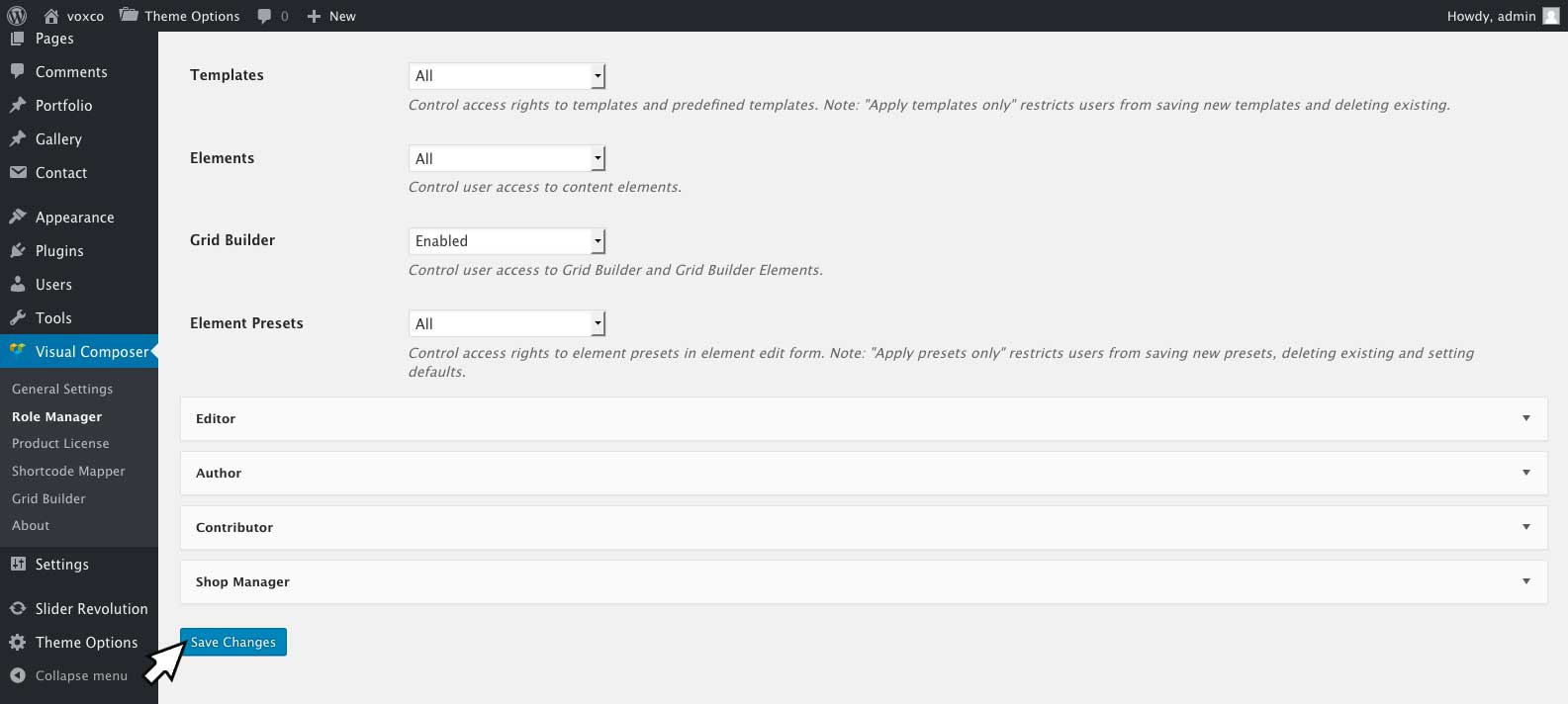
Click 'Save Changes'.
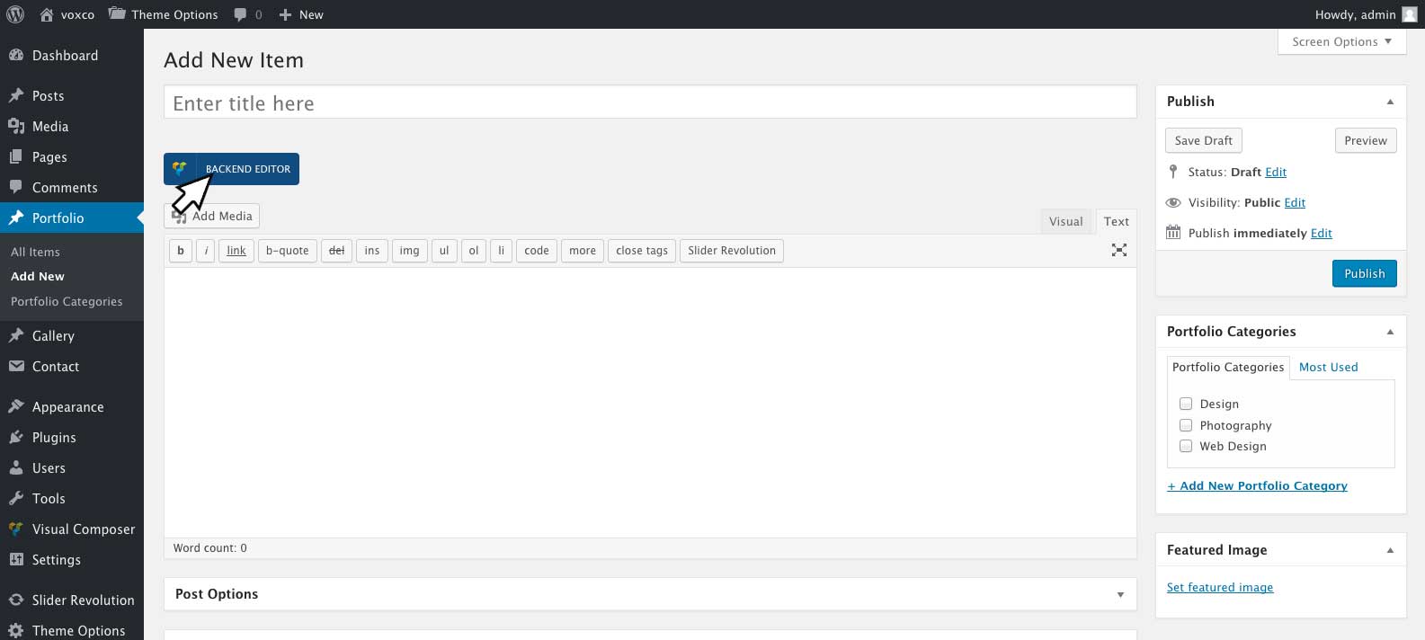
Now when editing a post or page you can click 'Backend Editor' to enter the visual composer editor.
Voxco Content Elements
The theme comes with some extra content elements for visual composer including:
 Pricing Table
Pricing table content element includes the following options, pricing tables are responsive and will fill width of the column they are placed in.
| Option Name | Description |
|---|---|
| Icon | Optional, select a icon to be displayed at the top of the pricing table header |
| Icon Color | Select the icon color |
| Header Background Color | Select the pricing table header background color |
| Border Color | Select the pricing table border color |
| Plan | Enter the name of the plan/pricing table heading |
| Plan Font | Select the plan font to be used. You may adjust your fonts under 'Theme Options' > 'Typography'. |
| Plan Font Color | Select the plan font color |
| Plan Font Color | Select the plan font color |
| Featured | Selecting featured 'Yes' will display your featured text. |
| Featured Text | Featured text will be displayed below the plan text. |
| Featured Text Font | Select the featured text font to be used. You may adjust your fonts under 'Theme Options' > 'Typography'. |
| Featured Text Font Color | Select the featured text font color. |
| Cost | Enter the cost of the plan |
| Currency | Enter the currency symbol for the plans cost |
| Cost Font | Select the cost font to be used. You may adjust your fonts under 'Theme Options' > 'Typography'. |
| Cost Font Color | Select the cost font color. |
| Button Text | Enter the pricing tables button text. |
| Button URL | Enter the URL for the pricing tables button to link to. |
| Button Link Target | Link target for button, enter _blank to open button link in a new tab. Leave this field empty to open the link in the same tab/window. |
| Button Color | Select the pricing tables button color. |
| Button Text Color | Select the pricing tables button text color. |
To add a list of features to your pricing table click the prepend to this pricing table button (cross icon) at the top of your pricing table, click feature and enter your feature text. You may add as manny features as you like.
 Portfolio
The portfolio content element will display your portfolio posts, and includes the following options:
| Option Name | Description |
|---|---|
| Categories | Select which portfolio category you would like the portfolio page to display. For instructions on adding portfolio categories please see Portfolio Categories |
| Filter Style |
In Main Menu - Will place the filter categories in your main menu Above Portfolio - Will place the filter categories above your portfolio posts. No Filters - Will remove the filter categories. |
Caption Background Color | Setting for portfolio posts caption background color. Can be overridden on individual portfolio post under 'Post Options' In 'Portfolio' > 'Edit Item'. |
| Caption Heading Color | Setting for portfolio posts caption heading color. Can be overridden on individual portfolio post under 'Post Options' In 'Portfolio' > 'Edit Item'. |
| Caption Heading Font | Setting for portfolio posts caption heading font. Font families can be adjusted under 'Theme Options' > 'Typography'. |
| Caption Categories Color | Setting for portfolio posts caption categories font color. Can be overridden on individual portfolio post under 'Post Options' In 'Portfolio' > 'Edit Item'. |
| Caption Categories Font | Setting for portfolio posts caption categories font. Font families can be adjusted under 'Theme Options' > 'Typography'. |
| Caption Vertical Alignment | Setting for the vertical position of portfolio posts caption text. Can be overridden on individual portfolio post under 'Post Options' In 'Portfolio' > 'Edit Item'. |
| Caption Horizontal Alignment | Setting for the horizontal alignment of portfolio posts caption text. Can be overridden on individual portfolio post under 'Post Options' In 'Portfolio' > 'Edit Item'. |
| Caption Crosshair Position | Setting for the position of the + icon on portfolio posts caption. Can be overridden on individual portfolio post under 'Post Options' In 'Portfolio' > 'Edit Item'. |
| Caption Hover Animation | Setting for animation to be used while hovering portfolio posts. |
 Hover Image
The hover image content element will display an image and content which will display while hovering the image. It includes the following options:
| Option Name | Description |
|---|---|
| Image | Select an image to be displayed. |
| Hover Color | Select the background color to be displayed while hovering the image. |
| Hover Content | Enter the content to be displayed while hovering the image |
 Page/Post Title
The Page/Post Title content element will display your page or post title and includes the following options:
| Option Name | Description |
|---|---|
| Custom Title Text | Optional custom text for the page/post title. Leave empty to use the page post title. |
| Sub Title Text | Optional sub title text. Leave empty for no subtitle. |
| Heading Font | Setting for the page/post title font. Font families can be adjusted under 'Theme Options' > 'Typography'. |
| Meta/Sub Title Font | Setting for the sub title and post meta font. Font families can be adjusted under 'Theme Options' > 'Typography'. |
| Display Post Meta? | Check to display the page/post author and publish date below the title. |
| Align | Select to align the page/post title left, right or center. |
| Title Color | Select the font color for your page/post title. Leave empty to use the selected fonts theme options color settings. |
| Meta/Sub Title Color | Select the font color for your page/post sub title and page/post meta. Leave empty to use the selected fonts theme options color settings. |
 Voxco Slider
Image panning slider. Note the Voxco Slider has absolute positionioning, it should be placed in its own column with no other content elements. You can adjust the height of the slider by setting the height of the column it is placed in for more information on setting column heights please see Add link. The width of the slider will be dertimend by the width of the column it is placed in. It includes the following options:
| Option Name | Description |
|---|---|
| Slider Images | Select the images to be used in the slider |
| Speed | Enter a numrical value for the speed to animate the paning slide show, speed is in pixels per second. If left empty theme option defaults will be used under > 'Theme Options' > 'Layout Options' > 'Side Header Settings' > 'Slider Speed'. |
 Owl Slider
Responsive image carasoul slider with swipe and drag support. It includes the following options:
| Option Name | Description |
|---|---|
| Slider Images | Select the images to be used in the slider |
| Auto Play | Enter a numrical value for the automatic playing speed of the image carasoul. Speed is in milli seconds eg. 1500 = 1.5 seconds. Leave empty to disable automatic playing. |
 Gallery
Light box gallery to display your gallery posts or images. It includes the following options:
| Option Name | Description |
|---|---|
| Gallery Source | Select the source of gallery. Select 'Media Gallery Posts' to display your media gallery posts. Select 'Images' to insert images. |
| Media Gallery Categories | Select the categories of media gallery posts to display. You may create and manage your categories by going to 'Gallery' > 'Media Categories'. |
| Images | Select images to display for the images gallery source. |
| Items Per Row | Select the ammout of gallery thumbnails to display per row. |
| Gap (pixels) | Enter a numerical value for the ammout of spacing between gallery thumbnails. Enter 0 for no spacing. |
 Blockquote
Inserts blockquote text. It includes the following options:
| Option Name | Description |
|---|---|
| Style | Selct the style of blockquot. Border Full wraps the whole quote in a border. Border Side places a border on the left side of the blockquote. |
| Text Color | Select the blockquote text color. |
| Border Color | Select the blockquote border color. |
| Font | Select the blockquote font. Font families can be adjusted under 'Theme Options' > 'Typography'. |
| Font Style | Select the blockquote font style. |
| Font Size (Pixels) | Enter a numerical value for the blockquote font size in pixels. |
| Content | Enter your quote. |
| Cite | Optional citation for the quote. |
| Cite Color | Select the citation text color. |
 Google Map
Inserts a Google map. It includes the following options:
| Option Name | Description |
|---|---|
| Title | Title of the map location. The tilte will be shown when click on the location map marker |
| Location | Enter an address for the map marker to be placed. |
| Height | Enter a numerical value for the height of the map in pixels. For a resposive height map/full colum height map you can enter 'full' and the map will be the same height as the column it is placed in. Note you must set the column height use a full height map for more information on setting column heights please see Add link. |
| Zoom | The resolution that the map will be loaded at. Enter a value between 0 and 21 (0 would display the entire world and 21 would display individual buildings). |
| Styled Map | Select yes if you wich to style the map with the below options Map Hue, Google Map Saturation and Google Map Brightness. If you wish to use Google's default map styles select No |
| Map Hue | Sets the basic color of the map |
| Google Map Saturation | Enter a value between -100 and 100 to set the intensity of the of the map hue the higher. The higher the value the more intense the map hue color will be |
| Google Map Brightness | Enter a value between -100 and 100 to set the brightness of the map. The higher the value the brighter the map will be. |
| Google Map Marker | You may upload a custom location marker for the map here. If you wish to use Google's default location maker you can leave this field empty. |
 Counter
Inserts a animated number counter that will count up to a number provided. It includes the following options:
| Option Name | Description |
|---|---|
| Style | Select a style for the counter. Details On Number will place the counter details on top of the number animation. Details Below Number will place the counter details below the number animation |
| Number | Enter a number for to counter to count up too. |
| Number Font | Select the number font. Font families can be adjusted under 'Theme Options' > 'Typography'. |
| Details | You may enter a description of the number beign counted here. |
| Details Color | Select the color for the counter details text. |
| Details Color | Select the font for the counter details. Font families can be adjusted under 'Theme Options' > 'Typography'. |
 Team
Team
Inserts an image with descriptions and social network links, usefull for creating team member bios. It includes the following options:
| Option Name | Description |
|---|---|
| Style | Select the team element style. Info on Hover Image will display the team member information and social network links when hovering the image. Info Below Image will display the team member information below the image and the social network links will be displayed while hovering the image. |
| Image | Select an image to be diplayed for the team member. |
| Name | Enter the team members name. |
| Name Font | Select a font to be used for the name text. Font families can be adjusted under 'Theme Options' > 'Typography'. |
| Role | Enter the role of the team member, the role will be displayed as a subtitle to the name |
| Role Font | Select a font to be used for the role text. Font families can be adjusted under 'Theme Options' > 'Typography'. |
| Description | Enter a description for the team member, the description text will be displayed below the team members name and role. |
| Hover Background Color | Select the background color to be displayed while hover the team member image. |
| Name Font Color | Select the font color for the name text. |
| Role Font Color | Select the font color for the role text. |
| Description Font Color | Select the font color for the description text. |
| Social Icons Color | Select the color of the social icon links. |
| Social Icon Links | Enter the URL for the icon to link to for each social icon you would like to display. |
 Social Networks
Displays the social network icon links set under 'Theme Options' > 'Social Networks'. It includes the following options:
| Option Name | Description |
|---|---|
| Align Icons | Select to align the icons left, right or center. |
| Icon Color | Select the icon color. |
Extra Attributes
The theme comes with some extra attributes for Visual Composer content elements including:
Column Height
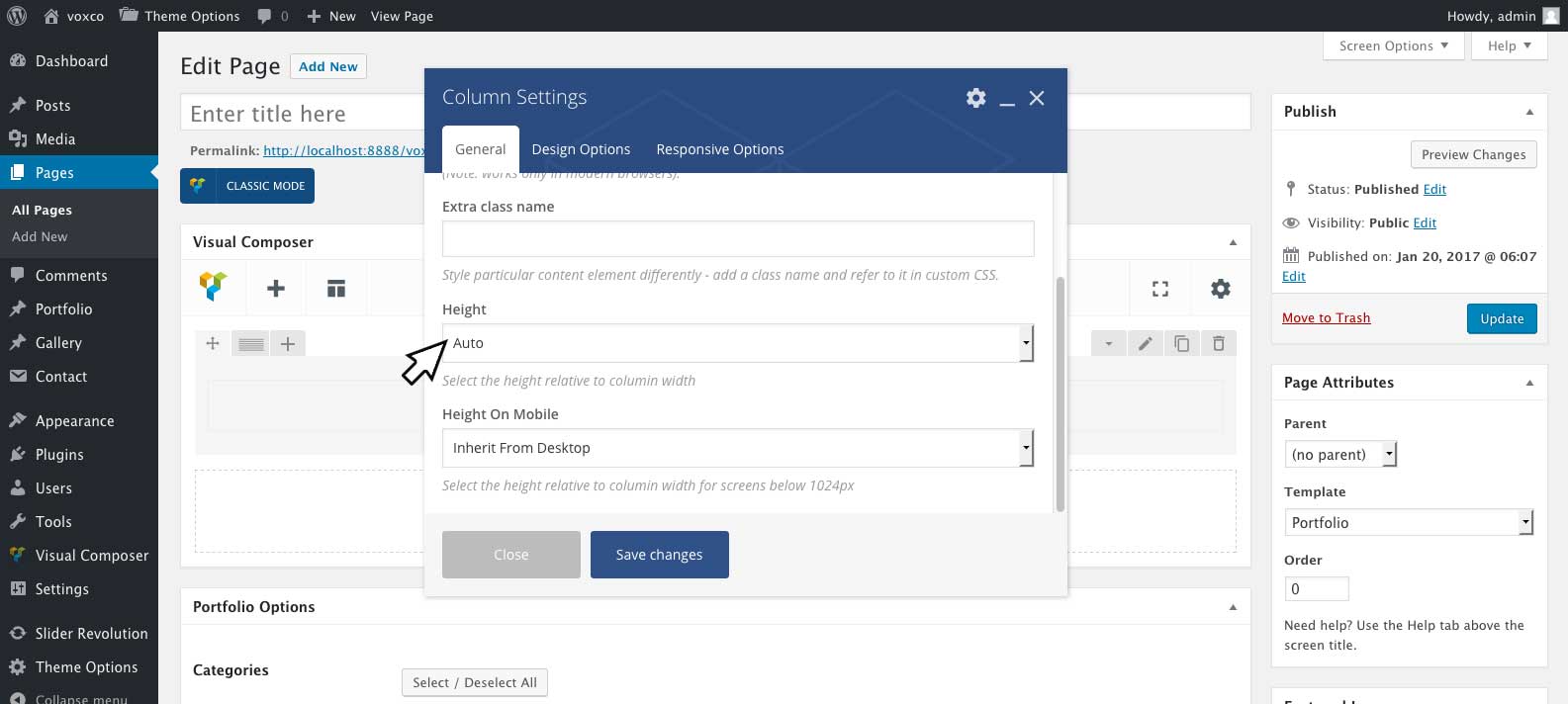
The column height can be set for each column under the column settings. To view the column settings click on edit this column icon at the top tof the column. The column height setting includes the following options:
| Option Name | Description |
|---|---|
| Auto | Standard column, automatic height. |
| Full (1:1) | 1:1 height, the height of the column will be the same as the width of the column. |
| Quarter (4:1) | 4:1 height, the height of the column will be equal to one quarter of the column width. |
| Third (3:1) | 3:1 height, the height of the column will be equal to one third of the column width. |
| Half (2:1) | 2:1 height, the height of the column will be equal to half of the column width. |
| Two Thirds (3:2) | 3:2 height, the height of the column will be equal to two thirds of the column width. |
| Four Thirds (3:4) | 3:4 height, the height of the column will be equal to the column width plus one third of the column width. |
| Double (1:2) | 1:2 height, the height of the column will be equal to twice the column width. |
| Full Screen | Full Screen height, the height of the column will be equal to the height of the browser window. |
Text Block Text Color
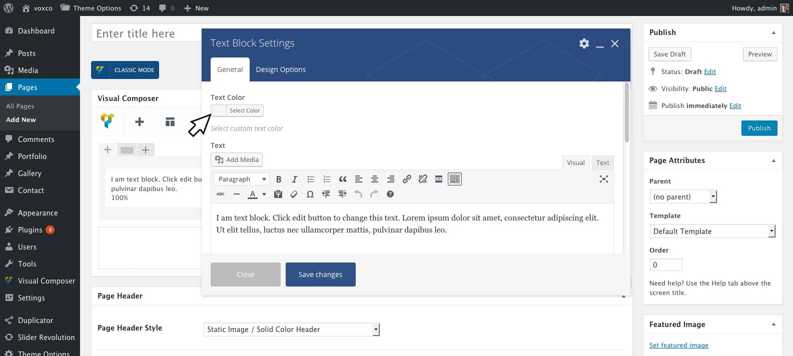
Quickly set the default color for all text in the textblock content element. Leave this option empty if you would like to use the default colors set in 'Theme Options' > 'Typography'. If you would like to use multiple colors of text in one text block, it is reccomend to use the standarnd wordpress text color settings in the WYSIWYG editor by clicking the toggle toolbar icon at the top of the editor, highlighting your text and selecting the text color from the text color icon.
Progress Bar Style
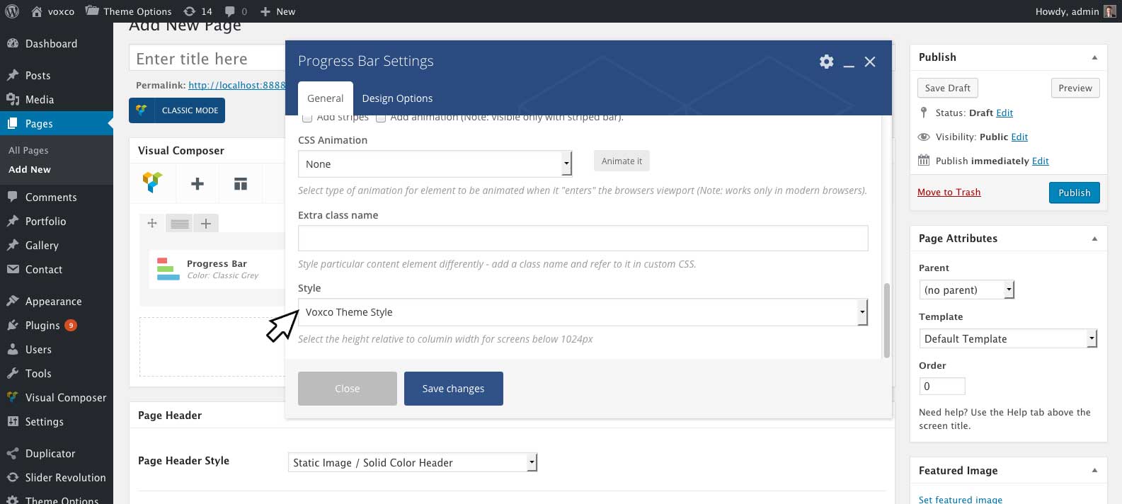
Select to use the Visual Coposer defalt styling for the progress bar or the theme included style.
| Option Name | Description |
|---|---|
| Visual Composer Style | A wider progress bar style with the lable on top of the progress bar. |
| Voxco Theme Style | A thiner progress bar style with the lable above the progress bar. |
Message Box Close Button
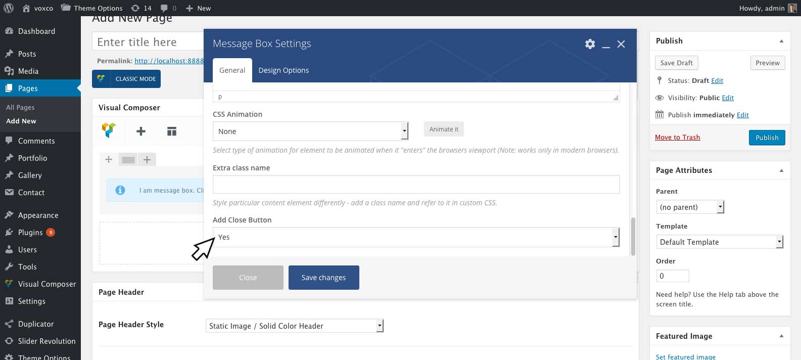
Adds a close button to the Visual Composer Message Box element, to remove the message box once clicked.
Theme Options Panel #back to top
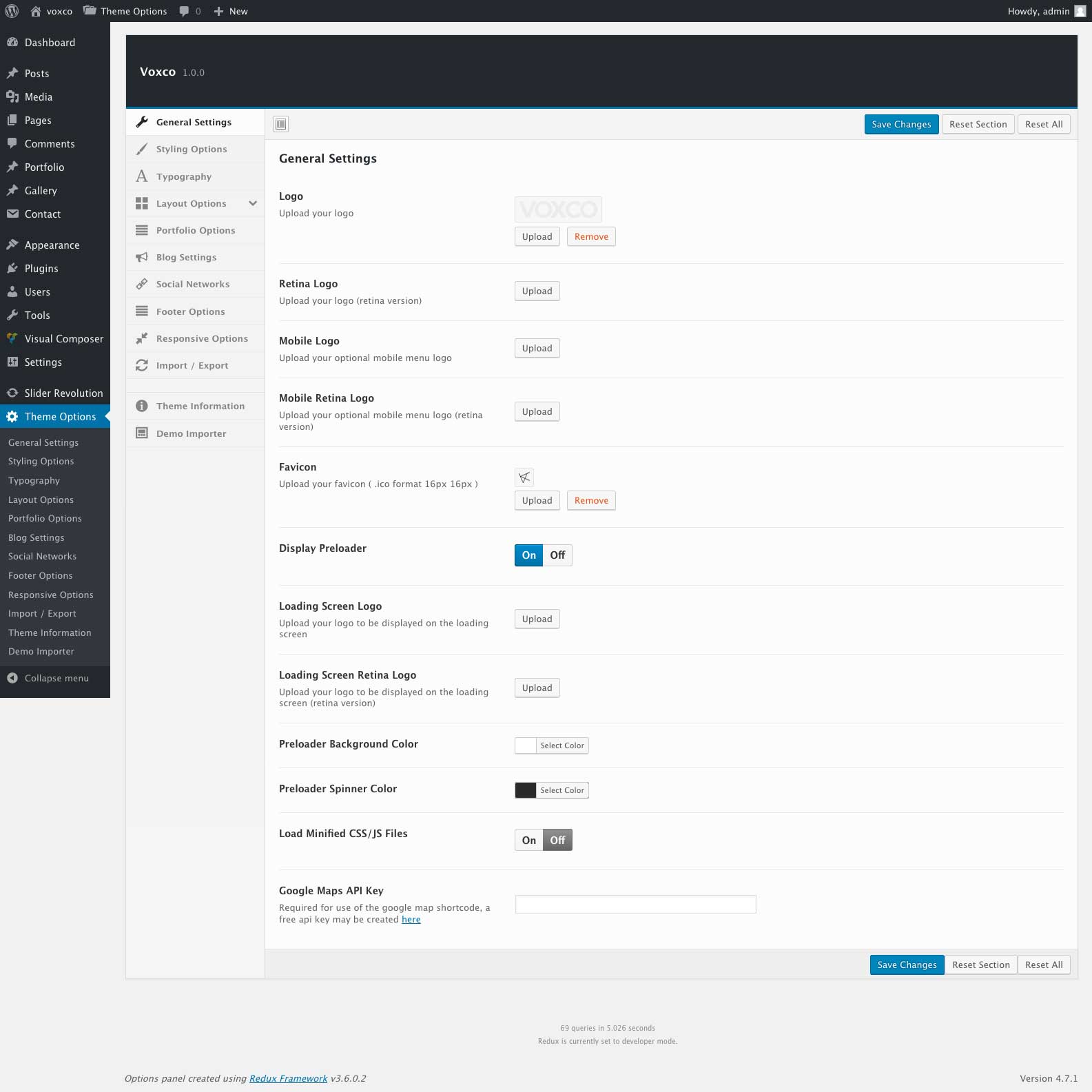
General Settings - #back to top
Here you can upload your logo and favicon, set your Google maps API Key and customize the preloading screen.
| Option Name | Description |
|---|---|
| Logo | Upload an image to be used for your sites logo. |
| Retina Logo | Upload a larger version of your logo (twice the size) for cripser display on retina devices and displays. |
| Mobile Logo | Upload and alternative version of your logo which will be displayded on mobile devices. Leave this field empty to dispaly your main logo on mobile devices. |
| Mobile Retina Logo | Upload a larger version of your mobile logo (twice the size) for cripser display on retina devices and displays. |
| Favicon | Upload a favicion image, Image should be .ico format and 16 x 16 pixels in size. |
| Display Preloader | Select to turn on or off the site loading icon. |
| Loading Screen Logo | If you choose to display the preloader icon, you may upload an image to be dispayed in the center of the preloader spinner here. Leave empty for a default spinner. |
| Loading Screen Retina Logo | Upload a larger version of your loading screen logo (twice the size) for cripser display on retina devices and displays. |
| Preloader Background Color | Select the background color of your preloader icon. |
| Preloader Background Color | Select the color of the spinner in your preloader icon. |
| Google Maps API Key | You will need to create and add an Google maps API key here if you which to use the Google Maps Content Element. You can create a api key for free at Google Maps APIs |
Styling Options - #back to top
Here you can set color options for various sections of your site including the menu main background colors, page border color and enter custom CSS for the theme
| Option Name | Description |
|---|---|
| Page Border Color | Select the page border color. The page border size can be adjusted under Layout Options. |
| Main Background Color | The Main Backgound Color will be used as the default background color for pages and portfolio posts. You may set blog archive pages and post background colors under Blog Settings. |
| Loading Screen Background Color | Select the background color which will be displayed while the site is loading. |
| Menu / Side Header Background Color | Select the background color for your menu and side header. For a transparent menu drag select any color and drag the color pikers transparecey slider down to 0. |
| Popup Menu Background Color | Background color for the popup on popup style menus. This includes menu styles 1,3 and 4 as shown in Demo 1, Demo 2, and Demo 4. |
| Mobile Menu Bar Color | Select the background color for the mobile menu bar. |
| Popup Menu Button Color / Mobile Menu Button Color | Sets the toggle menu button color for the mobile menu and the toggle menu button color for menu styles 1,3 and 4 as shown in Demo 1, Demo 2, and Demo 4... |
| Popup Menu Button Style / Mobile Menu Button Style | You may choose from a round or square style button for the the toggle menu button on mobile and the toggle menu button on menu styles 1,3 and 4 as shown in Demo 1, Demo 2, and Demo 4 |
| Menu Link Color | Select the color of your menu links |
| Active Menu Link Background Color | If set a background color will be placed on the current active page link in your menu. |
| Link Color | Select a default colors for text links. |
| Highlighted Text Background Color | Sets the background color shown while highlighting text. |
| Highlighted Text Font Color | Sets the text color shown while highlighting text. |
| Contact Form 7 Default Color | Sets the default border color of Contact Form 7 inputs and textareas. |
| Contact Form 7 Focus Color | Sets the border color of Contact Form 7 inputs and textareas when they are in focus. |
| Contact Form 7 Style | Minimal and Boxed Styles for Contact Form 7. Minimal style has a bottom border on inputs and textareas. Boxed style has a full border on on inputs and textareas |
| Custom CSS | You may enter custom CSS for your site here. |
Typography - #back to top
Here you can adjust font family, color, size and styles for your body font, headings, accent font, menu font, form font and dropcap font.
Layout Options - #back to top
Here you can modify the layout out of the site including the menu style
| Option Name | Description |
|---|---|
| Site Layout | Standard Header places the menu at the top of your site. Side Header places the menu on the left hand side of your site. |
| Page Border Width | Select the width of the border around the site in pixesl. Drag the slider down to 0 for no border. |
| Border on Side Header | If turned on will place an extra page border between your side header and content (only for use with Side Header Layout). |
| Content Offset from Main Container) | Adds a margin around the main content area of your site. If using the standard header style and do not whish to have the menu overlap your content, you can enter the height of your menu in the offset top option to move the content down. |
| Default Column Padding | Sets the default padding for columns. This size can be overriden on individual columns in visual composer under Column Settings > Design Options. |
Standard header settings- #back to top
Settings for use when you have select the Standard Header site layout option. Option tab is visible under layout options.
| Option Name | Description |
|---|---|
| Boxed Layout Max Width (Pixels) | If you wish to have a boxed layout site style, enter the width of the the boxed area here. |
| Boxed Layout Max Width (Pixels) | If you wish to have a boxed layout site style, enter the width of the the boxed area here. |
| Boxed Layout Body Background) | Select an optional background color or image for the body of the boxed layout. |
| Menu Style | Select a menu style. |
| Menu Bar Max Width (Pixels) | Enter a width in pixels for your menu bar for a full width menu leave this field empty. |
| Menu Outer Offset | Adds a margin around your menu bar |
| Menu Inner Offset | Adds padding to your menu bar |
| Menu Bar Height (Pixels) | Set the height of your menu par in pixels. |
| Fixed Menu Bar Scrolled Height (Pixels) | For a fixed menu bar you mas set a seperate height for the bar which will be used after scrolling down the page. |
| Fixed Navigation Bar | Turn on fix the navigation bat at the top of the page while scrolling |
| Fixed Navigation Bar | For use with menu style 4 (demo 4), if you dont wish to fix the whole menu bar and only the toggle menu button while scrolling turn on. |
Side Header Settings - #back to top
Settings for use when you have select the Side Header site layout option. Option tab is visible under layout options.
| Option Name | Description |
|---|---|
| Side Header Width | Set the width of your site header, width is based on the percentage width of the site |
| Side Header Slider Images | Upload the default images to be displayed in the side header panning slide show, for a solid color side header leave this field empty and select your background color under 'Styling Options' > 'Menu / Side Header Background Color'. For no slide show and a sinle static background image simply select one image. The default slide show images can be overriden on each page and post under Voxco Slider Options. |
The following settings are only for use with menu style three. They will be used on search, archive, 404 and the home page when you have set your front page to display latest posts under 'Settings' > 'Reading'. Content for the side header can be set on individual pages/posts under 'Edit Page/Post' > 'Side Header Options'.
| Side Header Content (for menu style three) | Enter the content to be displayed in the side header, leave empty for no content. |
| Side Header Content Color (for menu style three) | Select the color for the side header text. |
| Side Header Content Position (for menu style three) | Select the content position for the side header. |
Portfolio Options - #back to top
Here you can modify general settings for the portfolio, set options for indvidual portfolio pages and posts please see Creating Portfolio Pages > Portfolio Options and Creating Portfolio Posts > Post Options
| Option Name | Description |
|---|---|
| Portfolio Grid Column Sizes | Select the grid/column sizes to be used for your portfolio post thumbnails. Indvidual portfolio post thumbnail widths can be set under 'Edit Portfolio Item' > 'Post Options' > 'Thumbnail Width'. |
| Spacing between masonary portfolio items (pixels) | Enter a numerical value for the ammout of spacing between portfolio item thumbnails. Enter 0 for no spacing. |
| Portfolio categorys to exclude from prev/next post navigation. | You may select portfolio categories to remove from portfolio post navigation. Any portfolio items in selected categories will not be displayed the previous/next navigation at the bottom of each post. |
Blog Settings - #back to top
Here you can modify the plog pages styling
| Option Name | Description |
|---|---|
| Masonary Blog Column Size | Select the column sizes to be used for blog excerpts |
| Spacing between masonary blog items (pixels) | Enter a numerical value for the ammout of spacing between blog excerpts. Enter 0 for no spacing. |
| Automatic Excerpt Length (In Words) | Enter the length of words to be used in automatic excerpts. The length can be overridden on individual posts by using a manual excerpt. |
| Single Post Sidebar Style | Select the sidebar style to be used on single posts |
| Archive Sidebar Style | Select the sidebar style to be used on archive pages. |
| Off Canvas Sidebar Backround Color | Select the background color for the Off Canvas style sidebar. |
| Off Canvas Sidebar Font Color | Select the widget text color for the Off Canvas style sidebar. |
| Off Canvas Sidebar Button Color | Select the color for the open sidebar button on the Off Canvas Style sidebar. |
| Blog Excerpt Backround Color | Select the excerpt background color for standard posts, and the rollover background color for image posts. This setting can be overridden on indivual posts under 'Post Options' In 'Posts' > 'Edit Item'. |
| Blog Excerpt Border | Enter optional border settings for the porder around the post excerpt. |
| Blog Excerpt Heading Color | Select the excerpt post title color. This setting can be overridden on indivual posts under 'Post Options' In 'Posts' > 'Edit Item'. |
| Blog Excerpt Heading Font | Select the font to be used for excerpt post title. You may adjust your fonts under Typography. |
| Blog Excerpt Font Color | Select the excerpt font color. This setting can be overridden on indivual posts under 'Post Options' In 'Posts' > 'Edit Item'. |
| Archive Background Color | Select the background color to be used on blog archive pages. |
| Single Post Background Color | Select the background color to be used on single posts. |
| Apply Single Post Background Color to | For use when the content is offset from the main container under 'Layout Options' > 'Content Offset from Main Container'. Select to apply the background color to the whole page or only the content area. |
The following blog header settings will be used on search, archive and 404 pages or when you have set your front page to display latest posts under 'Settings' > 'Reading'. If you have set a posts page you may adjust the header settings for your main blog page using the header options shown when editing the posts page.
| Option Name | Description |
|---|---|
| Blog Header Style |
Static Image / Solid Color Header - Static image or solid color header. Select the image to display under 'Blog Header Background Image' or the color under 'Blog Header Background Color'. Parallax image header - Parallax image header, select the image to display under 'Blog Header Background Image'. Revolution Slider - Revolution Slider header, select a revoultion slider to display under 'Revolution Slider'. You will need to install and activate the revolution slider to use this header style. For more information on the revolution slider please see Revolution Slider To install the revolution slider please see add link No Header - Will not display a header for blog. Note: Parallax, Revolution Slider and No Header style headers are only available for the blog front page. For search, archive and 404 pages you can set the background image or color for the header under 'Blog Header Background Image' and 'Blog Header Background Color'. |
| Revolution Slider | Select a Revolution Slider to be displayed for the Revolution Slider header style. |
| Blog Header Height |
Full (1:1) - 1:1 height, the height of the header will be the same as the width of the header. Half (2:1) - 2:1 height, the height of the header will be equal to half of the header width. Half (3:1) - 3:1 height, the height of the header will be equal to one third of the header width. Half (4:1) - 4:1 height, the height of the header will be equal to one quarter of the header width. Full Screen - Full Screen height, the height of the header will be equal to the height of the browser window. |
| Blog Header Height On Mobile |
Full (1:1) - 1:1 height, the height of the header will be the same as the width of the header. Half (2:1) - 2:1 height, the height of the header will be equal to half of the header width. Half (3:1) - 3:1 height, the height of the header will be equal to one third of the header width. Half (4:1) - 4:1 height, the height of the header will be equal to one quarter of the header width. Full Screen - Full Screen height, the height of the header will be equal to the height of the browser window. |
| Full Screen Header Offset Size (Pixels) | For use when you have selected a full screen header height. The offset size will reduce the size of a full screen header by ammount of pixels entered. |
| Blog Header Stretch |
Stretch header - Full screen header width, header title and sub title will remain within the boxed layout. Streatch header and content - Full screen header width, header title and subtitle will be removed from the boxed layout Only for use while using the standard header with boxed layout. |
| Blog Header Margin Bottom | Bottom Margin for the blog header. Content below the header will be moved down by the ammount of pixesl entered. |
| Blog Title | Select the blog header title font to be used or no title. You may adjust your fonts under 'Typography'. |
| Blog Title Text | Enter the title text for your blog when you have set your font page to display latests posts under 'Settings' > 'Reading'. |
| Blog Title Color | Select the post/page subtitle font to be used or no title. You may adjust your fonts under 'Typography'. |
| Blog Title Color | Select the font color for your blog title. Leave empty to use the selected fonts theme options color settings. |
| Blog Title Alignment | Horiziontal alignment for your blog title. |
| Blog Title Vertical Alignment | Vertical alignment for your blog title. |
| Blog Header Background Image | Upload a background image for use with 'Static Image' or 'Parallax Image' header styles. |
| Blog Header Background Color | Select a background color for use with 'Solid Color' header style. |
Social Networks - #back to top
Enter you social network links in here.
Social network links can be displyed in your meny by selecting 'Display Icons In header' > 'On' under 'Layout Options' and can be displayed in your footer by selecting 'Display Icons In Footer' > 'On' under 'Footer Options'.
You can also display them in any page or post using the visual composer social network element.
Footer Options - #back to top
Footer style width logo content and colors for footer. The footer can be set to display on pages and posts by selecting the footer on/off option in the page or posts footer options meta box
| Option Name | Description |
|---|---|
| Footer Background Color | Select the background color for your footer |
| Footer Text Color | Select the color for text in your footer. |
| Footer Text Color | Select the color for links in your footer. |
| Footer Logo | Upload an image to be used for your footer logo. |
| Footer Retina Logo | Upload a larger version of your footer logo (twice the size) for cripser display on retina devices and displays. |
| Display Social Network Icons In Footer | Turn on to display your social network links in your footer. |
| Full Width Footer | For use with boxed layouts only, turn on to stretch the footer to the full width of the browser window. |
| Footer Copyright | You may enter copyright text for your site here. |
Responsive Options - #back to top
You may set additional sizes for fonts, page porder width, content offset from main container, default column padding and menu outer offset here. These sizes will be used for the mobile version of your site.
Import & Export Options - #back to top
Here you can copy/download your current option settings. Keep this safe as you can use it as a backup should anything go wrong, or you can use it to restore your settings on your site.
Support Desk #back to top
For theme support please submit a ticket at https://webdingo.ticksy.com
Please note theme support deals with answering of technical questions about item’s features and assistance with reported bugs and issues. Unfortuantally we are unable to provide support for customization of the themes files.
Version History (Changelog) #back to top
You can find the version history on theme sale page.
Once again, thank you so much for purchasing this theme. As I said at the beginning, I'd be glad to help you if you have any questions relating to this theme.
Changelog
                                        -----------------------------------------------------------------------------------------
                                        Version 1.0.0
                                        -----------------------------------------------------------------------------------------
                                        - Initial Release